• SR_spatial tweets

    • A "@Straphangers Campaign on steroids" ! Crain's piece on new group to focus on NYC-area airports cny.bz/XsqGKZ cc @grussian 9 hours ago
    • I've unsubscribed from about a dozen email lists today. Good start to the new year. #inboxdecluttering 1 day ago
    • Searchable, & full list for download. +1! council.nyc.gov/html/budget/da… RT @alykatzz: @azipaybarah @nyccouncil Including member items database! Nice. 2 days ago

Interactive “Comparinator” maps launched for NYC Council districting

UPDATE Sept 7, 2012

The City Council Comparinator site is now embeddable for your website, blog, etc.

Here’s how to use it:

  • go to the site,
  • zoom to a district and click to highlight it (or enter a street address),
  • choose one of the tabs above the map (Side-by-Side vs Overlay, for example), and
  • pick which proposal you’re comparing with (Districting Commission or Unity Plan).
  • Then click “Link” in the upper right and you’ll see the embed code as well as the basic linking code.

Sample embed code:

  • < iframe width=”600″ height=”450″ frameborder=”0″ scrolling=”no” marginheight=”0″ marginwidth=”0″ src=”http://www.urbanresearchmaps.org/citycouncildistricts/map.html?lat=40.75935&lon=-73.81138&zoom=14&identify=-73.805799628444%2C%2040.755706832582&popup=false&maptype=OVERLAY&districttype=UNITY1&attributelayer=Plurality2010&output=embed“></iframe >

We also added a feature: if you turn off the popup window before clicking “Link”, it’ll add a “popup=false” property to the URL, so the person viewing the link (or the starting image for your embedded map) won’t have the popup in the way but the district will still be highlighted.

Here’s an example:

  • Link: http://www.urbanresearchmaps.org/citycouncildistricts/map.html?lat=40.75935&lon=-73.81138&zoom=14&identify=-73.805799628444%2C%2040.755706832582&popup=false&maptype=OVERLAY&districttype=UNITY1&attributelayer=Plurality2010

ORIGINAL POST Sept 5, 2012:

NYC Council Districting and You

How existing City Council districts compare with proposed lines

Our Center for Urban Research (CUR) at the CUNY Graduate Center has launched an interactive map today to visualize proposed New York City Council districts compared with existing ones along with the demographic characteristics and patterns within the districts.

The Center hopes the map will help involve people in the NYC districting process simply by showing them how proposed or newly drawn lines looked in relation to their homes or workplaces. Our map is not for drawing districts; others such as the NYC Districting Commission are providing that service. But CUR’s comparison maps are designed to be be engaging enough to visualize the impact of redistricting for everyone from local citizens to redistricting professionals, hopefully inspiring people to participate more actively in the process.

CUR’s map was designed and is being maintained independently from the NYC Districting Commission’s website. However, we hope that people who use CUR’s maps will then access the Districting Commission’s website for drawing maps online.

Using the map

The main features of the map are as follows:

  • Enter your address to find out what district currently represents you, and which proposed district you’d live in.
  • If you’re using the “Side-by-Side” view, the current districts are displayed on the left, and the proposed districts on the right.
  • If you’re using the “Overlay” view, you can move the transparency slider to the right to display proposed districts, or to the left to fade back to current districts.
  • Click anywhere on the map to highlight the current and proposed districts.
  • When you enter an address or click on the map, an info window pops up listing the current and proposed districts. You can click the link for the current district to go to that Councilmember’s website.
  • Click the “Link” in the upper right of the page to get a direct link to the area of the map you’re viewing. (This one zooms in on City Council District 8 in Manhattan.) You can share this on Twitter or Facebook, email it to friends and colleagues, or blog about it and include the link.

Credits

The mapping application was developed by the Center for Urban Research. David Burgoon, CUR’s application architect, constructed and designed the site, with data analysis support and overall conception from CUR’s Mapping Service director Steven Romalewski.

The application relies on geographic data hosting by cartoDB, open source mapping frameworks and services including OpenLayers and Bing maps, and ESRI’s ArcGIS software for cartography and data analysis.

Data sources

Current City Council district boundaries and proposed maps from the NYC Districting Commission are based on block assignment lists provided at the Districting Commission’s website.

Other proposed maps such as the Unity Map are provided by the advocacy organizations who developed those proposals.

Mapping NYC stop and frisks: some cartographic observations

WNYC’s map of stop and frisk data last week got a lot of attention by other media outlets, bloggers, and of course the Twittersphere. (The social media editor at Fast Company even said it was ”easily one of 2012′s most important visualizations“.)

I looked at the map with a critical eye, and it seemed like a good opportunity to highlight some issues with spatial data analysis, cartographic techniques, and map interpretation - hence this post. New York’s stop and frisk program is such a high profile and charged issue: maps could be helpful in illuminating the controversy, or they could further confuse things if not done right. In my view the WNYC map falls into the latter category, and I offer some critical perspectives below.

TL; DR

It’s a long post :) . Here’s the summary:

  • WNYC’s map seems to show an inverse relationship between stop and frisks and gun recovery, and you can infer that perhaps the program is working (it’s acting as a deterrent to guns) or it’s not (as WNYC argues, “police aren’t finding guns where they’re looking the hardest”). But as a map, I don’t think it holds up well, and with a closer look at the data and a reworking of the map, the spatial patterns of gun recovery and stop and frisks appear to overlap.
  • That said, the data on gun recovery is so slim that it’s hard to develop a map that reveals meaningful relationships. Other visualizations make the point much better; the map just risks obscuring the issue. When we’re dealing with such an important — and controversial — issue, obscuring things is not what we want. Clarity is paramount.
  • I also make some other points about cartographic techniques (diverging vs. sequential color schemes, black light poster graphics vs. more traditional map displays). And I note that there’s so much more to the stop and frisk data that simply overlaying gun recovery locations compared with annual counts of stop and frisks seems like it will miss all sorts of interesting, and perhaps revealing, patterns.

As far as the map itself, here’s a visual summary comparing the WNYC map with other approaches. I show three maps below (each one zoomed in on parts of Manhattan and the Bronx with stop and frisk hot spots):

  • the first reproduces WNYC’s map, with its arbitrary and narrow depiction of “hot spots” (I explain why I think it’s arbitrary and narrow later in the post);
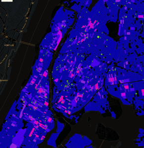
WNYC map

  • the second map uses WNYC’s colors but the shading reflects the underlying data patterns (it uses a threshold that represents 10% of the city’s Census blocks and 70% of the stop and frisks); and
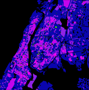
Modified hot spots (10% blocks representing 70% stop and frisks)

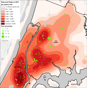
  • the third uses a density grid technique that ignores artificial Census block boundaries and highlights the general areas with concentrated stop and frisk activity, overlain with gun recoveries to show that the spatial patterns are similar.
Density grid


What WNYC’s map seems to show

The article accompanying the map says:

We located all the “hot spots” where stop and frisks are concentrated in the city, and found that most guns were recovered on people outside those hot spots—meaning police aren’t finding guns where they’re looking the hardest.

The map uses a fluorescent color scheme to show the pattern, by Census block, of the number of stop and frisk incidents in 2011 compared with point locations mapped in fluorescent green to show the number of stop and frisks that resulted in gun recovery.

The map is striking, no question. And at first glance it appears to support the article’s point that guns are being recovered in different locations from the “hot spots” of stop, question, and frisk incidents.

But let’s dig a bit deeper.

Do the data justify a map?

This is a situation where I don’t think I would’ve made a map in the first place. The overall point - that the number of guns recovered by stop and frisks in New York is infinitesimally small compared to the number of stop and frisk incidents, putting the whole program into question - is important. But precisely because the number of gun recovery incidents is so small (less than 800 in 2011 vs. more than 685,000 stop and frisks), it makes it unlikely that we’ll see a meaningful spatial pattern, especially at the very local level (in this case, Census blocks which form the basis of WNYC’s map).

And the point about extremely low levels of gun recovery compared with the overwhelming number of stop and frisk incidents has already been presented effectively with bar charts and simple numeric comparisons, or even infographics like this one from NYCLU’s latest report:

If we made a map, how would we represent the data?

For the point of this blog post, though, let’s assume the data is worth mapping.

WNYC’s map uses the choropleth technique (color shading varies in intensity corresponding to the intensity of the underlying data), and they use an “equal interval” approach to classify the data. They determined the number of stop and frisk incidents by Census block and assigned colors to the map by dividing the number of stop and frisks per block into equal categories: 1 to 100, 100 to 200, 200 to 300, and 400 and above.
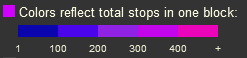
(Later in this post I comment on the color pattern itself - diverging, rather than sequential - and also about the fluorescent colors on a black background.)

Although they don’t define “hot spot,” it appears that a hot spot on WNYC’s map is any block with more than either 200, 300, or 400 stop and frisks (the pink-to-hotpink blocks on their map). If we take the middle value (300 stop and frisks per block), then the article’s conclusion that “most guns were recovered on people outside those hot spots” is correct:

  • there are a mere 260 Census blocks with a stop and frisk count above 300, and in these blocks there were only 81 stop and frisk incidents during which guns were recovered;
  • this accounts for only 10% of the 779 stop and frisks that resulted in gun recoveries in that year.

But you could argue that not only is the WNYC definition of a “hot spot” arbitrary, but it’s very narrow. Their “hot spot” blocks accounted for about 129,000 stop and frisks, or only 19% of the incidents that had location coordinates (665,377 stop and frisks in 2011). These blocks also represent less than 1% (just 0.66%) of the 39,148 Census blocks in the city, so these are extreme hot spots.

The underlying data do not show any obvious reason to use 300 (or 200 or 400) as the threshold for a hot spot - there’s no “natural break” in the data at 300 stop and frisks per block, for example, and choosing the top “0.66%” of blocks rather than just 1%, or 5%, or 10% of blocks doesn’t seem to fit any statistical rationale or spatial pattern.

If we think of hot spots as areas (not individual Census blocks) where most of the stop and frisk activity is taking place, while also being relatively concentrated geographically, a different picture emerges and WNYC’s conclusion doesn’t hold up.

[A note on my methodology: In order to replicate WNYC's map and data analysis, I used the stop and frisk data directly from the NYPD, and used ArcGIS to create a shapefile of incidents based on the geographic coordinates in the NYPD file. I joined this with the Census Bureau's shapefile of 2010 Census blocks. I determined the number of stop and frisks that resulted in gun recovery slightly different than WNYC: they only included stop and frisks that recovered a pistol, rifle, or machine gun. But the NYPD data also includes a variable for the recovery of an assault weapon; I included that in my totals.]

Choropleth maps: it’s all in the thresholds

Creating a meaningful choropleth map involves a balancing act of choosing thresholds, or range breaks, that follow breaks in the data and also reveal interesting spatial patterns (geographic concentration, dispersion, etc) while being easy to comprehend by your map readers.

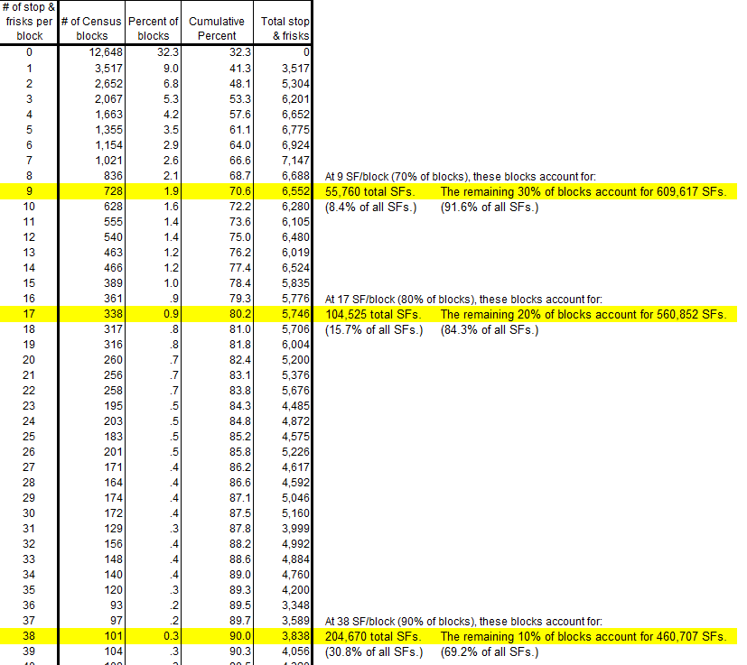
If we look at the frequency distribution of stop and frisks in 2011 by Census block, we start to see the following data pattern (the excerpt below is the first 40 or so rows of the full spreadsheet, which is available here: sqf_2011_byblock_freq):
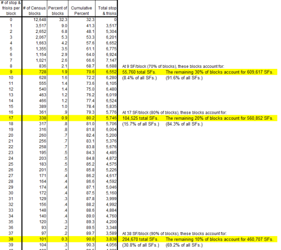
Click the image for a high-resolution version.

The frequency distribution shows that most blocks on a citywide basis have very few stop and frisks:

  • Almost a third have no incidents.
  • 70% of blocks have less than 9 incidents each while the remaining 30% of blocks account for almost 610,000 incidents (92%).
  • 80% of blocks have less than 17 stop and frisks each, while the remaining 20% account for 560,000 incidents (almost 85%).
  • 90% of the blocks have 38 or fewer incidents, while the remaining 10% account for 460,000 incidents (just under 70% of all stop and frisks).

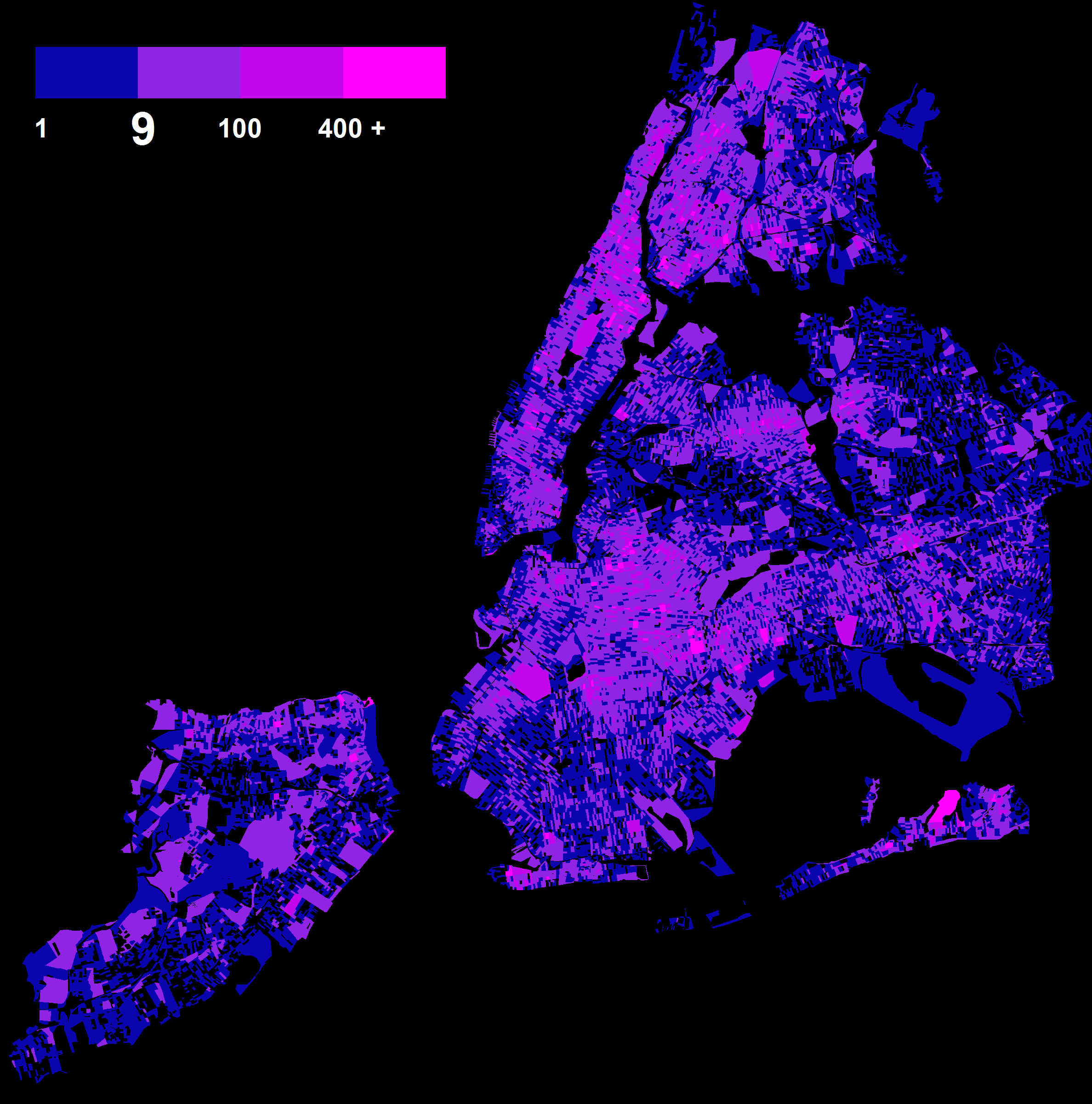
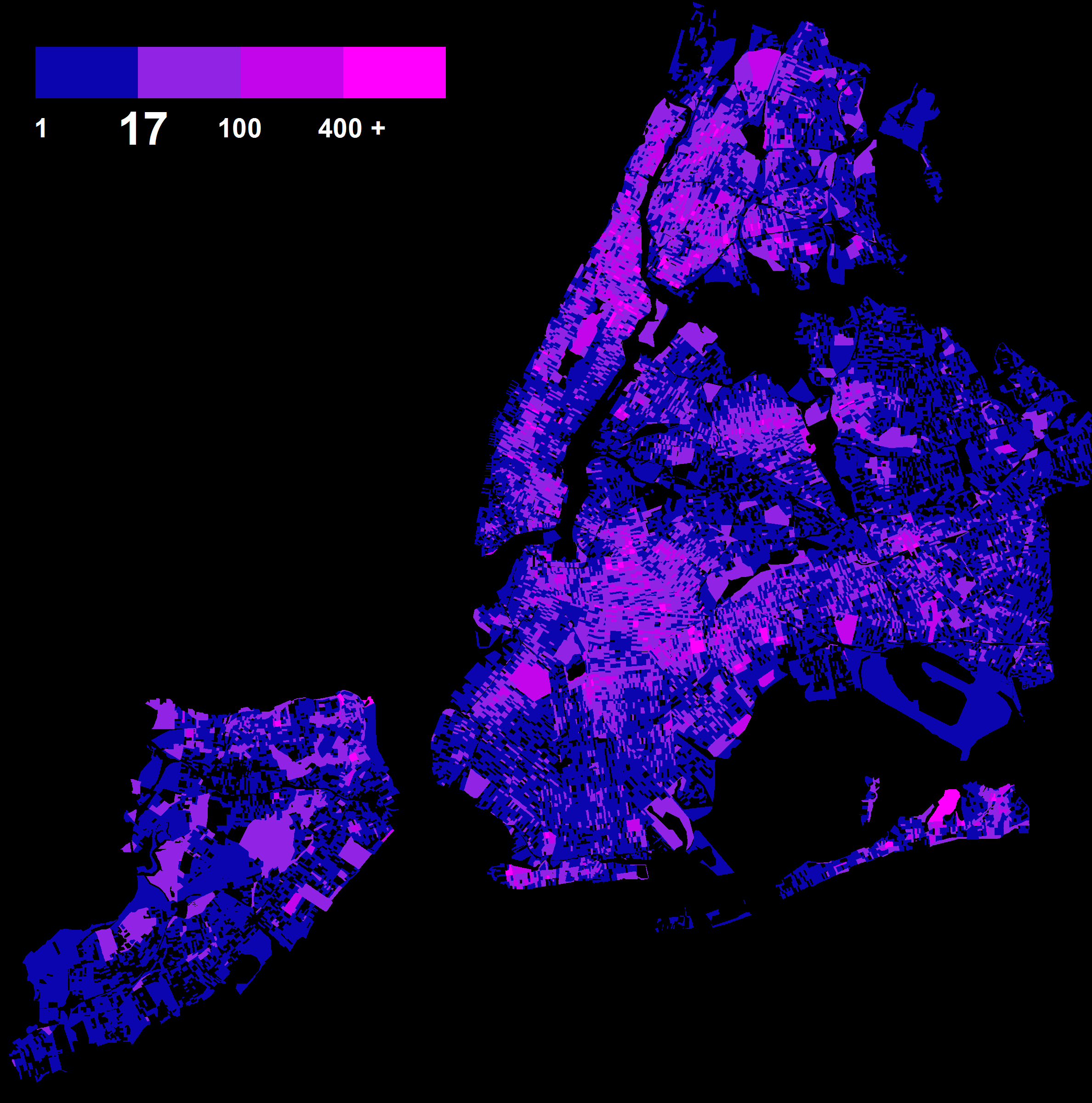
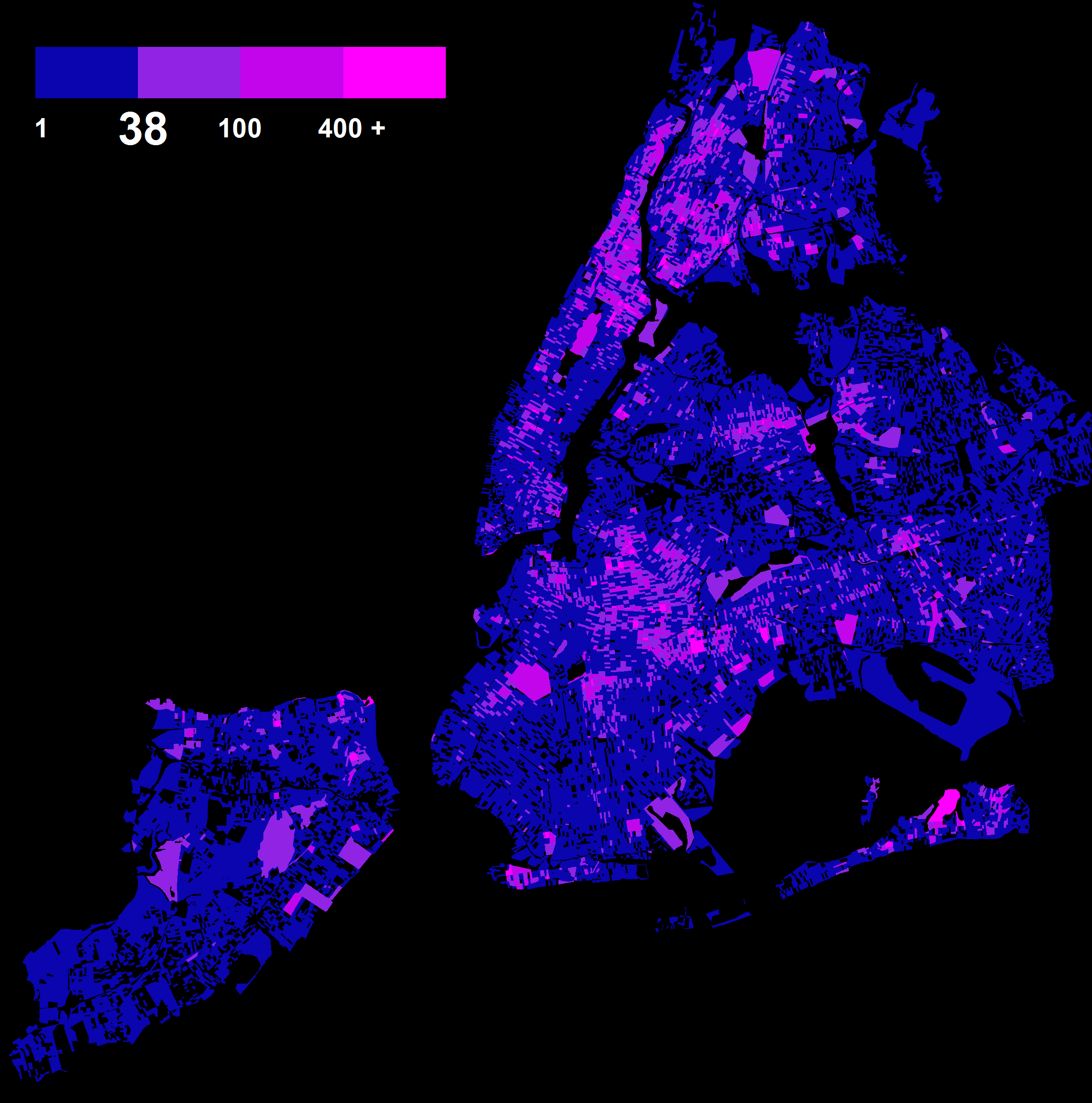
It’s a very concentrated distribution. And it’s concentrated geographically as well. The following maps use WNYC’s color scheme, modified so that there’s one blue color band for the blocks with the smallest number of stop and frisks, and then pink-to-hot pink for the relatively few blocks with the greatest number of stop and frisks. The maps below vary based on the threshold values identified in the spreadsheet above:
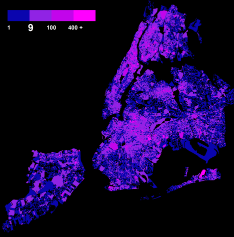
30% of blocks are “hot”, accounting for 92% of stop and frisks
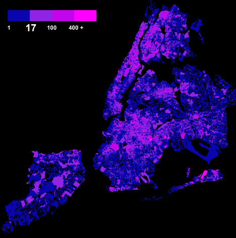
20% of blocks are “hot”, accounting for 84% of stop and frisks
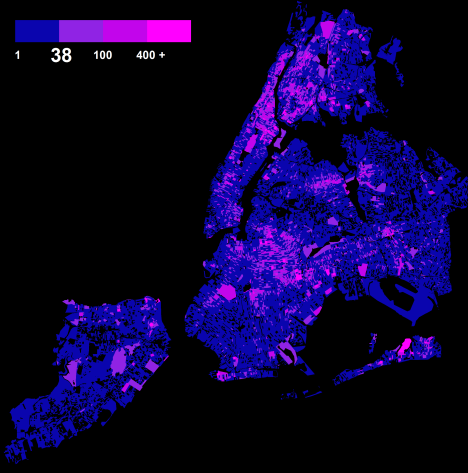
10% of blocks are “hot”, accounting for 70% of stop and frisks

In the choropleth balancing act, I would say that a threshold of 9 or 17 stop and frisks per block is low, and results in too many blocks color-coded as “hot”. A threshold of 38 reveals the geographic concentrations, follows a natural break in the data, and uses an easily understood construct: 10% of the blocks accounting for 70% of the stop and frisks.

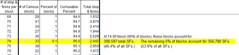
We could take this a step further and use the threshold corresponding to the top 5% of blocks, and it would look like the following — here’s an excerpt from the spreadsheet that identifies the number of stop and frisks per block that we would use for the range break (74):
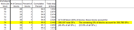
Click the image for a high-resolution version.

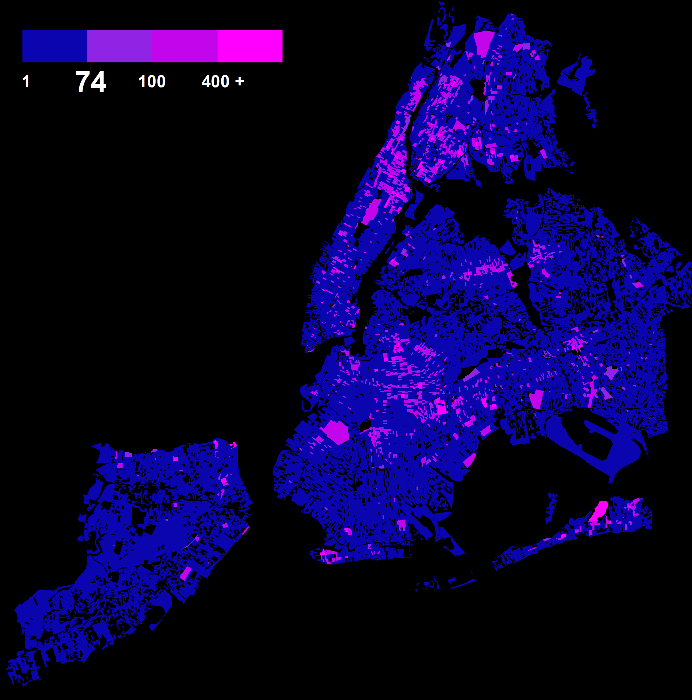
And here’s the resulting map:
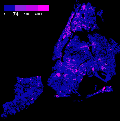
But this goes perhaps too far - the top 5% of blocks only account for half of the stop and frisks, and the geographic “footprint” of the highlighted blocks become too isolated - they lose some of the area around the bright pink blocks that represent areas of heightened stop and frisk activity. (Although even the 74 stop and frisks per block threshold is better than the arbitrary value of 300 in WNYC’s map.)

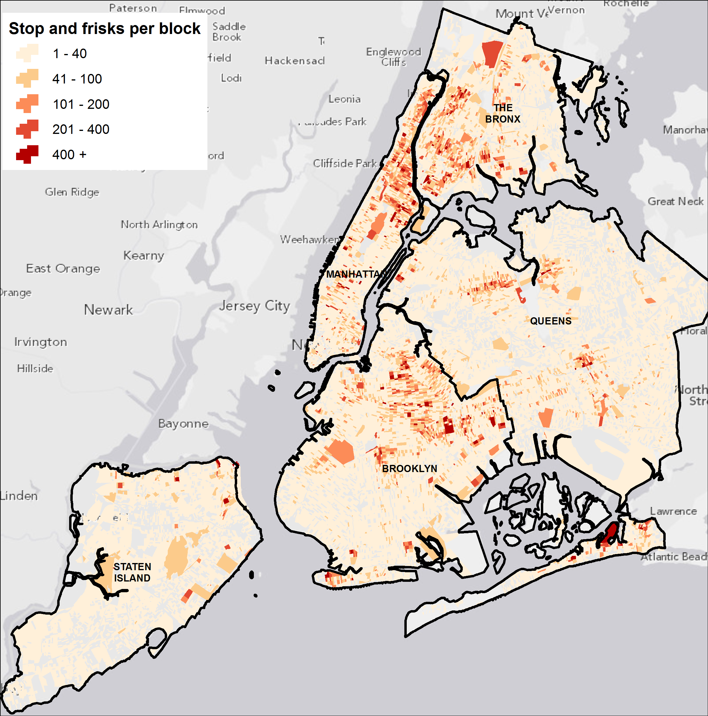
The two maps below compare WNYC’s map with this modified approach that uses 38 stop and frisks per block as the “hot spot” threshold (for map readability purposes I rounded up to 40). The maps are zoomed in on two areas of the city with substantial concentrations of stop and frisk activity - upper Manhattan and what would loosely be called the “South Bronx”:

WNYC map

Modified thresholds: 1-40, 41-100, 101-400, 400+

To me, the second map is more meaningful:

  • it’s based on a methodology that follows the data;
  • visually, it shows that the green dots are located generally within the pink-to-hot pink areas, which I think is probably more in line with how the Police Department views its policing techniques — they certainly focus on specific locations, but community policing is undertaken on an area-wide basis; and
  • quantitatively the second map reveals that most gun recoveries in 2011 were in Census blocks where most of the stop and frisks took place (the opposite of WNYC’s conclusion). The pink-to-hot pink blocks in the second map account for 433 recovered guns, or 56% of the total in 2011.

The following two maps show this overlap on a citywide basis, and zoomed in on the Brooklyn-Queens border:
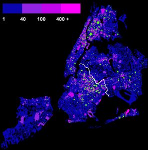
Modified thresholds, citywide, with gun recovery incidents
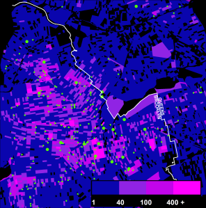
Modified thresholds, along Brooklyn-Queens border, with gun recovery incidents

I’m not defending the NYPD’s use of stop and frisks; I’m simply noting that a change in the way a map is constructed (and in this case, changed to more closely reflect the underlying data patterns) can substantially alter the conclusion you would make based on the spatial relationships.

Hot spot rasters: removing artificial boundaries

If I wanted to compare the stop and frisk incidents to population density, then I’d use Census blocks. But that’s not necessarily relevant here (stop and frisks may have more to do with where people shop, work, or recreate than where they live).

It might be more appropriate to aggregate and map the number of stop and frisks by neighborhood (if your theory is to understand the neighborhood dynamics that may relate to this policing technique), or perhaps by Community Board (if there are land use planning issues at stake), or by Police Precinct (since that’s how the NYPD organizes their activities).

But each of these approaches runs into the problem of artificial boundaries constraining the analysis. If we are going to aggregate stop and frisks up to a geographic unit such as blocks, we need to know a few things that aren’t apparent in the data or the NYPD’s data dictionaries:

  • Were the stop and frisks organized geographically by Census block in the first place, or were they conducted along a street (which might be straddled by two Census blocks) or perhaps within a given neighborhood in a circular pattern over time around a specific location in the hopes of targeting suspects believed to be concealing weapons, that resulted in a single gun recovery preceded by many area-wide stop and frisks? In other words, I’m concerned that it’s arbitrary to argue that a gun recovery has to be located within a Census block to be related to only the stop and frisks within that same block.
  • Also, we need to know more about the NYPD’s geocoding process. For example, how were stop and frisks at street intersections assigned latitude/longitude coordinates? If the intersection is a common node for four Census blocks, were the stop and frisks allocated to one of those blocks, or dispersed among all four? If the non-gun recovery stop and frisks were assigned to one block but the gun recovery stop and frisk was assigned to an immediately adjacent block, is the gun recovery unrelated to the other incidents?

As I’ve noted above, the meager number of gun recoveries makes it challenging to develop meaningful spatial theories. But if I were mapping this data, I’d probably use a hot spot technique that ignored Census geography and followed the overall contours of the stop and frisk patterns.

A hot spot is really more than individual Census blocks with the highest stop and frisk incidents. It also makes sense to look at the Census blocks that are adjacent to, and perhaps nearby, the individual blocks with the most stop and frisks. That’s typically what a hot spot analysis is all about, as one of the commenters at the WNYC article pointed out (Brian Abelson). He referred to census tracts instead of blocks, but he noted that:

A census tract is a highly arbitrary and non-uniform boundary which has no administrative significance. If we are truly interested in where stops occur the most, we would not like those locations to be a product of an oddly shaped census tract (this is especially a problem because census tracts are drawn along major streets where stops tend to happen). So a hot spot is only a hot spot when the surrounding census tracts are also hot, or at least “warm.”

Census block boundaries are less arbitrary than tracts, but the principle applies to blocks as well. A hot spot covers an area not constrained by artificial administrative boundaries. The National Institute of Justice notes that “hot spot” maps often use a density grid to reveal a more organic view of concentrated activity:

Density maps, for example, show where crimes occur without dividing a map into regions or blocks; areas with high concentrations of crime stand out.

If we create a density grid and plot the general areas where a concentration of stop and frisks has taken place, using the “natural breaks” algorithm to determine category thresholds (modified slightly to add categories in the lower values to better filter out areas with low levels of incidence), we get a map that looks like this:
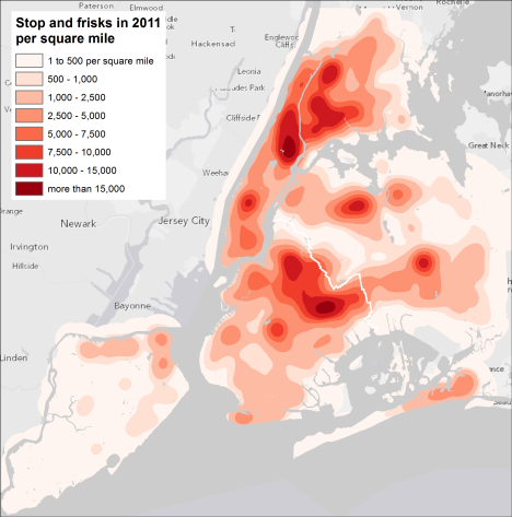
There were so many stop and frisks in 2011 that the density numbers are high. And of course, the density grid is an interpolation of the specific locations - so it shows a continuous surface instead of discrete points (in effect, predicting where stop and frisks would take place given the other incidents in the vicinity). But it highlights the areas where stop and frisk activity was the most prevalent - the hot spots - regardless of Census geography or any other boundaries.

Plotting the individual gun recovery locations against these hot spots produces the following map:
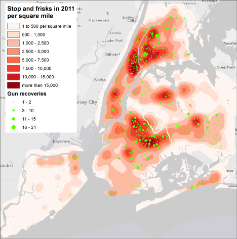
The spatial pattern of gun recoveries generally matches the hot spots.

Nonetheless, even this density map perhaps is too generalized. There are additional analyses we can do on the stop and frisk data that might result in a more precise mapping of the hot spots - techniques such as natural neighbor, kriging, and others; controlling the density surface by introducing boundaries between one concentration of incidents and others (such as highways, parks, etc); and filtering the stop and frisk data using other variables in the data set (more on that below). Lots of resources available online and off to explore. And many spatial analysts that are much more expert at these techniques than me.

Other map concerns

I replicated WNYC’s diverging color scheme for my modified maps above. But diverging isn’t really appropriate for data that go from low number of stop and frisks per Census block to high. A sequential color pattern is probably better, though I think that would’ve made it harder to use the fluorescent colors chosen by WNYC (a completely pink-to-hot pink map may have been overwhelming). As ColorBrewer notes, a diverging color scheme:

puts equal emphasis on mid-range critical values and extremes at both ends of the data range. The critical class or break in the middle of the legend is emphasized with light colors and low and high extremes are emphasized with dark colors that have contrasting hues.

With this data, there’s no need for a “critical break” in the middle, and the low and high values don’t need emphasis, just the high. The following example map offers an easier to read visualization of the patterns than the fluorescent colors, where the low value areas fade into the background and the high value “hot spots” are much more prominent:
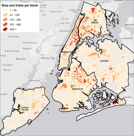
This map might be a bit boring compared to the WNYC version :) but to me it’s more analytically useful. I know that recently the terrific team at MapBox put together some maps using fluorescent colors on a black background that were highly praised on Twitter and in the blogs. To me, they look neat, but they’re less useful as maps. The WNYC fluorescent colors were jarring, and the hot pink plus dark blue on the black background made the map hard to read if you’re trying to find out where things are. It’s a powerful visual statement, but I don’t think it adds any explanatory value.

Other data considerations

The stop and frisk databases from NYPD include an incredible amount of information. All sorts of characteristics of each stop and frisk are included, the time each one took place, the date, etc. And the data go back to 2003. If you’d like to develop an in-depth analysis of the data - spatially, temporally - you’ve got a lot to work with. So I think a quick and not very thorough mapping of gun recovery compared with number of stop and frisks doesn’t really do justice to what’s possible with the information. I’m sure others are trying to mine the data for all sorts of patterns. I look forward to seeing the spatial relationships.

The takeaway

No question that a massive number of stop and frisks have been taking place in the last few years with very few resulting in gun recovery. But simply mapping the two data sets without accounting for underlying data patterns, temporal trends, and actual hot spots rather than artificial block boundaries risks jumping to conclusions that may be unwarranted. When you’re dealing with an issue as serious as individual civil rights and public safety, a simplified approach may not be enough.

The WNYC map leverages a recent fad in online maps: fluorescent colors on a black background. It’s quite striking, perhaps even pretty (and I’m sure it helped draw lots of eyeballs to WNYC’s website). I think experimenting with colors and visual displays is good. But in this case I think it clouds the picture.

Long Island special districts mapped online for the 1st time

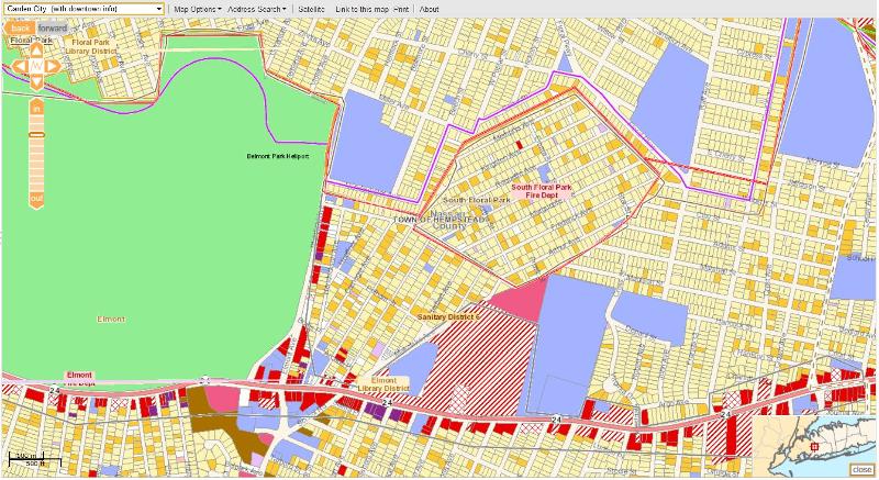
In partnership with the Long Island Index, our team at the CUNY Graduate Center has mapped the complex and complicated special taxation districts and service provider areas throughout Nassau County. We’ve updated this information at the Index’s mapping site, along with a new street address search feature.

I couldn’t say it any better than the Index’s news release on the project, so I’ve reproduced that verbatim below.


Nassau County’s Special Districts and Service Providers Mapped for the First Time

The Long Island Index, in collaboration with the Center for Urban Research at the CUNY Graduate Center, launched a new tool on its website that for the first time provides public access to maps representing the profusion of special districts that exist within Nassau County’s villages and towns. Visitors to the site are now able to search by street address or village to view any or all of the 240 fire, sanitation, water, library, parks, parking, police, school and sewer districts - as well as areas where local, county, or state government provides these services - and see clearly who provides what services and where. This new tool is the result of a comprehensive project to delineate all service provider boundaries using computer-mapping software, which integrates data on special districts from multiple sources. The maps are intended to give taxpayers and service providers a common and consistent basis for discussing special district issues.

map

The Long Island Index’s new mapping tool allows visitors to view any or all of the 240 fire, sanitation, water, library, parks, parking, police, school and sewer service providers in Nassau County.

Want to know how many different entities provide water services in Nassau County and their exact boundaries? Well, now you can see them. Want to know who provides water services in your community? Want to know how they are organized, which are special districts, which are town services? You can find that too. With the click of the mouse you can find the contact information and election data for all the service providers for your property. “This is the kind of tool we were looking for when we first started studying how services are provided on Long Island,” said Ann Golob, Director of the Long Island Index. “It didn’t exist so we took on the effort and have worked for over two years to collect, analyze and digitize this information. I think it will be a tremendous resource for the region.”

Also available on the site is a report by the Center for Governmental Research (CGR) in Rochester that explains the historical context surrounding the founding of special districts on Long Island along with the issues associated with so many providers. The CGR report, and the data found on the maps (provider names, URL, contact information, election data) can be downloaded from the either the Index Web site or the interactive maps site.

Steven Romalewski, director of the CUNY Mapping Service at the Center for Urban Research, said: “The maps bring a new level of information which will be a valuable resource for anyone trying to understand how special districts affect them. To create the service provider maps, we used raw data from the Nassau County assessor’s office, worked with the Index to validate the information independently, and reviewed additional data such as printed maps, historical metes and bounds, and some boundary maps in computer format from Nassau County. The online navigation is quick and easy with dynamic tools such as transparencies and map layers that combine seamlessly with the existing demographic, land use, and transportation data on the site.”

The site also features a detailed glossary of terms to help people understand the complex nature of different special districts across the county. For example, within the 54 library districts in Nassau County, there are four types: an Association Library, a School District Public Library, a Special District Public Library, and a Public Village Library. The glossary explains how each of these were established, how they are funded, bonding authority, if employees are subject to civil service law, and to what extent the community can be involved.

According to Long Island Association President Kevin Law, “These maps give Long Islanders a fantastic new tool for understanding the complexities that exist within our numerous special districts. It is really the first time that we can see who has what and where. It provides an opportunity to think out of the box about consolidation, which has the potential to improve efficiencies and stabilize taxes. People are only going to be supportive of this kind of initiative if they understand what is going on and these maps clearly show how multiple layers of government are a challenge for Long Island.”

“Civic organizations trying to research special districts in their own communities now have a powerful resource that never existed before,” said Nancy Douzinas, President of the Rauch Foundation and Publisher of the Long Island Index. “These maps will undoubtedly be of significant assistance to community groups, government agencies, private businesses and anyone else interested in Long Island’s communities.” In addition to the support from the Rauch Foundation, the Hagedorn Foundation helped support the initial mapping work leading to this project.

The Long Island Index plans to incorporate Suffolk County’s special districts in the coming months. The Long Island Index special district mapping feature is accessible at www.longislandindexmaps.org.

NYS Congressional districts & eligible voters mapped

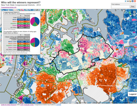
Just three months after the US District Court approved the redistricted Congressional districts for New York, the state is holding primary elections for Republican and Democratic candidates for Congress and US Senate.

In an effort to help analysts understand the voting patterns for the primary and general elections for Congress in New York, our Center for Urban Research at the CUNY Graduate Center has updated a map of Congressional districts to highlight the differences between eligible voters by district and overall population counts. The map is accessible at www.urbanresearchmaps.org/nycongress2012/map.html

Among other things, our new map displays the “citizen voting age population” (CVAP) estimates for each district as well as overall population counts. When you visit the map, move your mouse over each district to display total population counts by race/ethnicity along with “citizen voting age population” (CVAP) estimates. We also have a brief analysis of CVAP estimates compared with total population for each district.

In many Congressional districts, especially in New York City, news reports have noted the changing demographics, partly due to population shifts but also due to new boundaries that are the result of redistricting. Districts that may once have had a predominantly Black population, for example, may now have a more mixed population.

But overall race and ethnicity population counts only tell part of the story. Population data from the decennial 2010 Census include all residents — citizens as well as recent immigrants who may not yet be citizens, and people who are of voting age (18 or older) as well as children. In some cases, the eligible voting population has a much different racial and ethnic profile than the overall population.

Welcome to 1940s New York

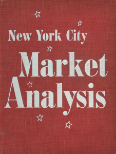
Now that data on an individual basis is available from the 1940 Census, our Center for Urban Research at the CUNY Graduate Center has launched Welcome to 1940s New York. The website is based on a 1943 “NYC Market Analysis” rich in local maps, photos, data, and narrative, providing a rare glimpse into life in New York City during that time.

We’re making this available both as context for the 1940 Census information, and for researchers and others generally interested in learning about New York in the ’40s. The New York Times has also published an article about the project, highlighting some then-and-now photos and demographic statistics of selected neighborhoods across the city.

My post below provides some background about how we came to develop the website. It also highlights some of the more intriguing things you’ll find there.

Piquing a graduate student’s interest

In 1997 the New York Bound bookstore was going out of business. I was a graduate student at Columbia University’s urban planning program, immersed in learning about all things New York. Of course, the bookstore’s sale was a must-visit event.
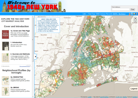
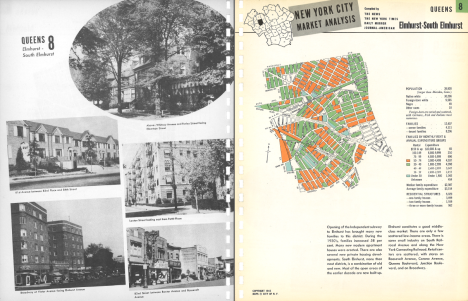
The bookstore was full of fascinating items, but most were either too expensive or too arcane for my interests. But one item fell right in the middle: not too pricey (the $100 was worth it, given the contents) and absolutely captivating, especially for someone like me who was also immersed in learning about computer mapping at the time.

The document was a New York City Market Analysis, published in 1943. Inside the cover the bookstore staff had written “Scarce Book”. I leafed through it and was amazed at the color-coded maps of every neighborhood in the city, visualizing down to the block what each area was paying in rent at the time. Each of 116 neighborhood profiles also included statistics from the 1940 Census, a narrative highlighting key socio-economic trends at the local level, and a handful of black & white photos.

My “Aha!” moment

I knew the document would come in handy one day. But once I bought it, it pretty much just sat idle on my shelf. That is, until earlier this year when news of the 1940 Census data coming online started to pick up steam. Lightbulb! If we could republish the 1943 Market Analysis, it would provide context for the individual 1940 data, and the 1940 Census would be a great hook to focus attention on this incredible historic resource documenting city life from that era.

The 1943 document was copyrighted. But copyright law as subsequently amended required copyright owners to explicitly renew the copyright within 28 years or forego rights to the material. In this case, the 28 year period ran to 1971. With the help of CUNY’s legal team and others, we determined that the copyright was not renewed. The 1943 document is in the public domain.

Welcome to 1940s New York

Our team at the CUNY Graduate Center decided that an easy but effective way to republish the material would be with a simple interactive map: click on a neighborhood to display its 1943 profile. The project became more involved than that — and our effort is still very much a work in progress — but that basic feature is what’s available at our Welcome to 1940s New York website.

We use DocumentCloud to provide easy access to the entire 1943 document, as well as neighborhood-specific profiles such as the example below:

Highlights from the neighborhood profiles

At CUR’s website we provide a detailed overview of how the Census statistics from 1940 compares with the city of today. I’ve highlighted some items below:

Population comparisons

Each neighborhood’s population size is compared with another U.S. city (e.g., with a population of almost 180,000 in 1940, Williamsburg, Brooklyn was “larger than Fort Worth, Tex.”) The comparisons reflect a time when the city’s population — overall, and even for specific neighborhoods — dwarfed most other urban areas across the country.

Color-coded Maps: rent too damn high even in 1940?!

The maps portray the geographic patterns of monthly rent levels across the city, ranging from under $30 to $150 per month or more. After adjusting for inflation, the high-end rent would be just under $2,500 in today’s dollars – in some contemporary neighborhoods, still a relatively modest rent.

With the maps, you can see for yourself how closely or not the patterns match life in our city today. As you do, take a moment to appreciate the cartographic craftsmanship involved in color coding each block based on Census data. No desktop computers or Google Maps back then!

Hundreds of Photos

Each profile includes black & white photos from the early 1940s, usually of typical residential or commercial blocks in the neighborhood. The photos are angled in the original, so don’t worry that the scanning process tilted the images.

Narratives

Each profile includes a brief description of the neighborhood. The emphasis is on local socio-economics, but the depictions offer a window into local demographic changes afoot at the time. Here’s the narrative for Maspeth, Queens as an example:

Maspeth is not a thickly settled district, but it enjoyed a 10 percent population growth in the 1930-1940 decade. The southwestern portion is an industrial area. Much of the southeastern portion is devoted to cemeteries. The residential area consists almost entirely of one and two-family dwellings. Most of the houses adjoining the industrial area are old and in the low rental group. There are some newer homes in the northern section of the district. The balance of the homes are of the less pretentious type. Grand Avenue is the main shopping street.

Borough maps and statistics

The 1943 document also provides six fold-out, color maps - one for each borough and one citywide - along with economic statistics at a boro-wide level such as:

  • manufacturers (number of establishments, wages, and value of products);
  • wholesale and retail trade;
  • number of families owning a radio set;
  • aggregate value of savings deposits; and
  • number of residential telephones.

A collaborative effort

The Welcome to 1940s New York website is the result of David Burgoon’s professionalism, creativity, and efficient, effective development. Kristen Grady georeferenced maps from the 1943 document in order to create a GIS layer of neighborhood areas which you see on the website, as well as the citywide map of rent levels. The website’s logo was designed by Jeannine Kerr.

The website relies on jQuery, the basemap is from MapBox, map navigation is provided through Leaflet.js, and the neighborhood map layer is hosted by cartoDB.

We are indebted to DocumentCloud for hosting the individual scanned pages from the 1943 document, and for providing online access to the material, including high-resolution versions of the Market Analysis profiles.

Several people reviewed early versions of Welcome to 1940s New York and provided helpful critiques and recommendations for improvement. Hopefully we did justice to their suggestions. They include: Jordan Anderson, Neil Freeman, Kristen Grady, Amanda Hickman, Michael Keller, Nathaniel V. Kelso, Jeannine Kerr, and Dan Nguyen.

The individual pages from the 1943 Market Analysis were scanned by the FedEx Office staff at the 34th St & Madison Ave location. Big thanks to them!

What’s next

We have reached out to potential partners to expand and enhance this project, hoping to leverage the 1940 Census data and other vintage statistics, maps, and photos to paint a richer picture of life in New York during the first half of the 20th century. This includes:

  • working with the NYC Department of City Planning’s Population Division — home to even more decades-old maps and data at the local level (down to city blocks) and citywide; and
  • discussing a potential exhibit (or exhibits) with local institutions such as the Museum of the City of New York, the New-York Historical Society, and/or the NY Public Library.

I’ve been lucky enough to pore over the original myself, and seeing it (and experiencing it in a tactile way) is inspiring. I worry that making it accessible interactively the way we’ve done it – neighborhood by neighborhood – disembodies it perhaps too much. (Online access makes it widely available, but maybe takes something away from the experience, sigh.) But nonetheless I hope everyone can check out the website, get a sense of what New York was like more than 70 years ago, and put the material to good use.

Enjoy!

Citi Bike NYC: the first and last mile quantified

The NYC Department of Transportation revealed last week where they’d like to place 400 or so bike share stations in Manhattan and parts of Brooklyn and Queens, as the next step in the city’s new bikeshare program starting this summer. (By next spring the city plans to locate a total of 600 bike share kiosks for 10,000 bikes.)

Several blogs and news reports have criticized the cost of the program as too expensive for relatively long bike trips (more than 45 minutes). But the program is really designed primarily for the “first and last mile” of local commutes and tourist trips to and from their destinations. Now that the city’s map is out, we can evaluate how likely it is that the locations will meet this goal.

Subway and bus proximity

Last year I examined the thousands of bike share kiosks suggested by “the crowd” to see how closely they were located to subway entrances. I determined that, as of late September 2011 based on almost 6,000 suggestions, one-third of the suggested sites were within 500 feet (actually, if I had used 750 feet — the average distance between avenues in Manhattan - it would’ve been 45% of the suggested sites located that distance or closer to a subway entrance). You can still see the crowdsourced locations here.

So about half of “the crowd’s” suggestions were close to public transit, and the other half further away. That seems reasonable — perhaps half the suggesters were thinking of how to link bike share with the subway system, and the other half was thinking about linking bike share to destination sites further away from mass transit.

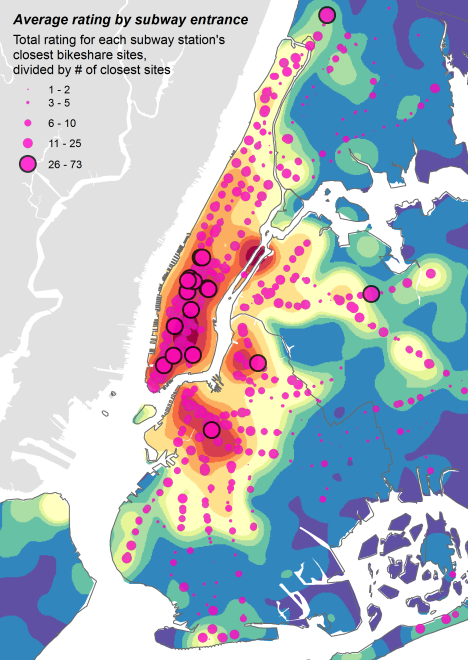
Here’s my map from last year of the subway entrances symbolized based on the ratings of the closest suggested bike share kiosks. This map says, “If you want to put bikeshare stations near subway entrances, these are the entrances you’d pick based on the average rating of the closest stations suggested by the crowd”:

I had suggested this as a way of prioritizing the bikeshare station siting process. These subway entrances are the ones you’d likely start with, based on the preferences of the (bike)riding public who contributed to the DOT/OpenPlans map.

But now that the bikeshare station siting process is pretty much done, I’ve examined whether the proposed kiosks are close enough to subway and bus stops to actually facilitate their use by the intended audiences.

How do the actual proposed locations measure up?

For me, the city’s proposed bike share program is a great deal — if the kiosks are near my home and my office. I live on Manhattan’s west side and work in midtown. Since I live near my office I’m lucky to have a pretty easy commute. But usually that involves a good amount of walking: my trip uptown is just one subway stop, and then going crosstown involves either a bus (luckily the M34 Select Bus is pretty reliable) or a schlep walk of several avenues. Don’t get me wrong — walking is great exercise. But if I could shorten the walk and save money, I’m all in.

According to DOT’s map [PDF], there’s a bike share kiosk proposed down the block from my apartment, and another one a block from my office. Nice! I could actually replace the subway/bus combo with a bike ride for a fraction of the cost. But what about the rest of the Phase 1 area? Are the kiosk locations designed to easily extend subway and bus trips for the “last mile”?

Here’s what I found: most of the proposed bikeshare locations are relatively close to subway entrances, and even more are closer to bus stops. At least regarding the locations, the system seems right on track to meet its goals of facilitating New York’s commuter and tourist trips.

Here’s what I measured

The DOT bike share website displays the proposed kiosks on a Google Map. But a separate URL lists the lat/lons of each site (in JSON format). There are 414 bike share lat/lons at this URL (not the 420 that all the news accounts referenced), and one location has a lat/lon of zero (ID 12405), so I deleted it leaving me with 413 locations. (I used Google Refine to convert the JSON file to CSV and imported it to ArcGIS to analyze the locations.)

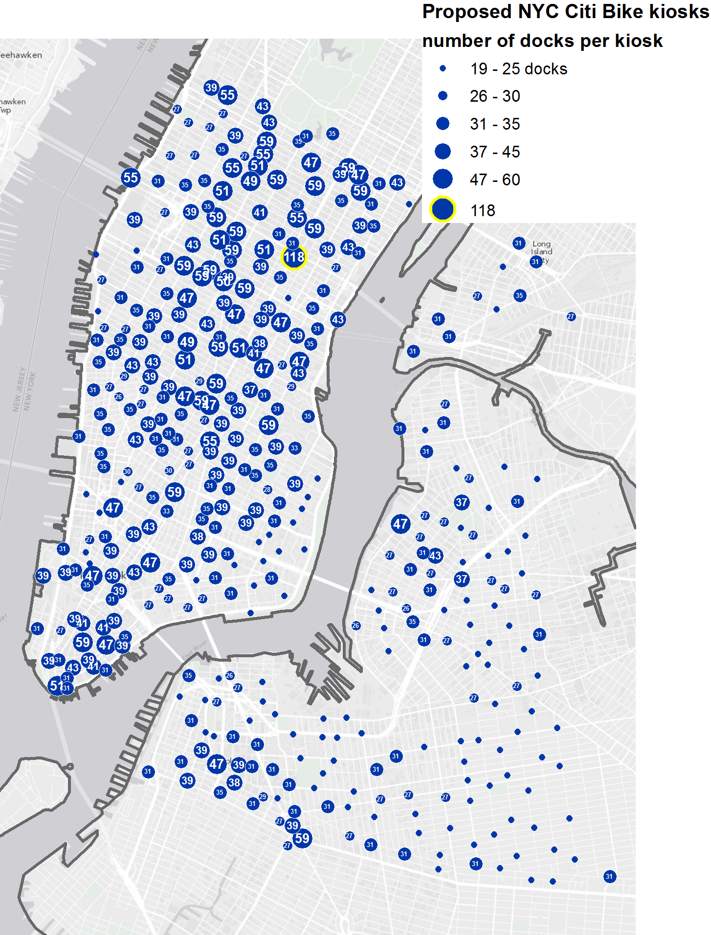
But this data just shows the locations. It omits information about each site (such as “North side of East 47th Street near Madison Avenue ”), and the number of bike “docks” at each proposed kiosk. Separately, Brian Abelson wrote a script to access this information from DOT’s website, based on a URL that looks like this:

http://a841-tfpweb.nyc.gov/bikeshare/get_point_info?point=12127

(His R script is here: https://gist.github.com/2690803 . With this data I was able to map the kiosks based on number of docks at each one; see map below. Big thanks to Brian!)

Here’s an interactive version (thanks to cartoDB), and here are links if you’d like to download the file in GIS format:

Proximity to subways

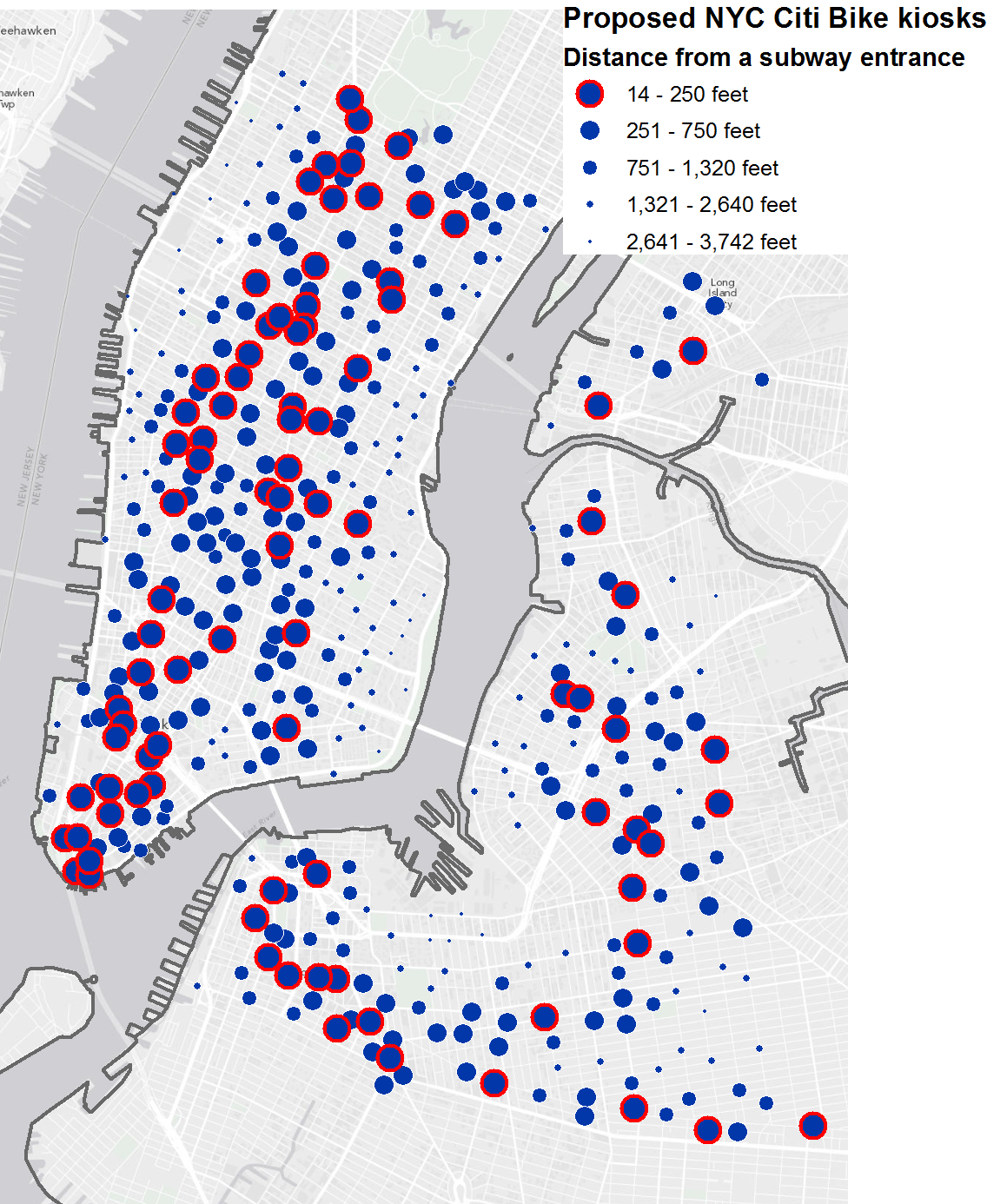
Here’s the map of proposed kiosks in relation to the closest subway entrances (based on the latest data from MTA on subway entrances/exits); I used ArcGIS’s “Near” function to calculate the distance:

Here are the stats:

  • 89 locations (22%) between 14 and 250 feet (length of a typical Manhattan block);
  • 117 kiosks (28%) between 250 and 750 feet (the average distance between Manhattan avenues);
  • 97 kiosks (24%) between 750 and 1,320 ft (a quarter mile);
  • 89 kiosks (22%) between 1,320 and 2,640 ft (a half mile); and
  • 21 kiosks (5%) further than 2,640 feet.

(The percentages do not equal 100% due to rounding.)

Closest/furthest:

  • The proposed kiosk closest to a subway entrance is in lower Manhattan, on the west side of Greenwich St near Rector St (ID 12364), 14 feet from the Rector St entrance to the 1 train.
  • The kiosk furthest from a subway entrance is on Manhattan’s west side, in the Hudson River Greenway near West 40th Street (at the West Midtown Ferry Terminal; ID 12092), almost three-quarters of a mile (3,742 feet) from the 40th St entrance to the 42nd St/Port Authority Bus Terminal station.

In other words, half of the proposed kiosks are within an avenue of a subway entrance, one-quarter are within two avenues, and the rest are further away.

So I guess it depends on your level of optimism (glass half full or half empty), and/or how far you’re willing to walk between your destination and a bike rack to participate in the Citi Bike program. But in general it seems that the proposed kiosks match the overall location patterns of the crowdsourced suggestions, and also support the goal of facilitating first/last mile transportation.

Proximity to buses

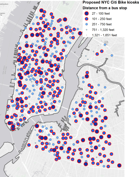
Here’s the map of proposed kiosks in relation to the closest bus stops (based on the latest data from MTA / ZIP file). Note that I didn’t differentiate between local, limited, or express bus stops. As with subway entrances, I used ArcGIS’s “Near” function to calculate the distance:

For bus riders, the bike share locations are even better suited than subway riders to help them go the last mile:

  • 55 proposed kiosks (13%) between 27 and 100 feet (less than a typical Manhattan block);
  • a whopping 199 kiosks (48%) between 100 and 250 feet (length of a typical block);
  • 139 kiosks (34%) between 250 and 750 ft (typical distance between Manhattan avenues);
  • 16 kiosks (4%) between 750 and 1,320 ft (quarter mile); and
  • only 4 kiosks (1%) further than 1,320 ft — and none further than 1,652 feet away (about a third of a mile);

So for bus riders, almost two-thirds of the proposed kiosks are within a block of a bus stop, and almost all of them (95%) are within an avenue. Pretty good odds that bus riders will have extremely convenient access to the Citi Bike program.

I was skeptical of the program at first (and I’m still a bit wary of so many more bikes on the road all of a sudden — I walk in fear when I cross a city street, because of cars and bikes). But now that the Citi Bike program is moving closer to reality and the numbers look so good, I’m looking forward to trying it out.

Putting transit GIS data to use

UPDATE:

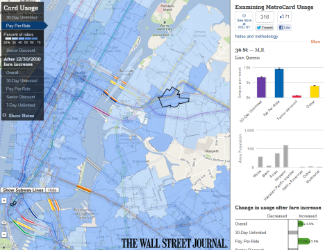
I was reminded recently that Albert Sun‘s terrific Wall St Journal interactive about the spatial patterns of Metrocard usage uses the subway routes in GIS format that I created. It’s not a major part of the map; the routes are used as a backdrop more than anything. But I was glad the Journal was able to use the data. (Per the notes from the map, the subway data was “from the MTA. Demographic data from the U.S. Census Bureau. Additional work refining subway line shapes from the CUNY Mapping Service at the City University of NY Graduate Center.”) Here’s a screen shot:


ORIGINAL POST

Recently I’ve come across several examples of people being able to use the MTA subway and bus data that I had converted to GIS format a couple of years ago. I know that I’ve been able to put the data to good use. But I’m especially glad to see others benefiting from my efforts.

So I thought I’d share some maps and links below. Hopefully this will inspire others to use the data, and to let us know about other examples. If you’ve been able to use the subway or bus GIS data, please let drop me a line by email or add a comment to this post. Thanks!

Distance Cartograms

Zach Nichols wrote a week ago that he incorporated my GIS version of NYC subway routes into a blog post about “re-scaling NYC based on MTA transit time.” Here’s one of his maps (a “distance cartogram”); very cool!

Mobile apps

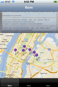
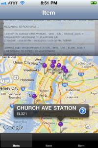
One of the entrants in last year’s MTA AppQuest contest used the subway route GIS data as a layer on their map for reference. The app — Dead Escalators — is being updated for distribution in the iTunes App Store. Look for it there soon! In the meantime, here are a couple of screen shots:

GIS data for student projects

  1. Liz Barry’s students at the New School are incorporating the data into their projects. Glad to be of help, and thanks Liz for your kind words!
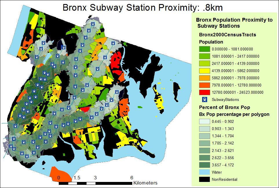
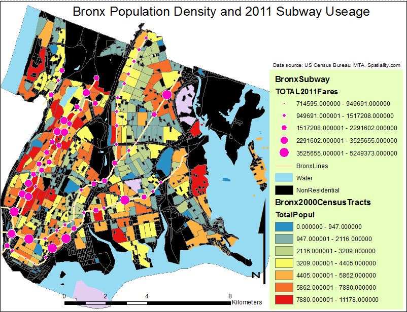
  2. Christopher Bride, a GIS student at CUNY’s Lehman College, used the data for his Capstone project this year examining the intersection of food deserts and the likely route home from subway/bus stations. The project’s goal is to pinpoint fresh food-critical neighborhoods in New York City. Here are two sample maps, focused on the Bronx:

  1. Lauren Singleton-Meyers at NYU’s Steinhardt School of Culture, Education and Human Development used the subway routes for a project with the New York Center for Alcohol Policy Solutions, for a campaign she’s launched to stop alcohol advertising on public transportation in the city. As a start, she’s mapped schools and subway routes and stations. Next steps will be to link pictures of alcohol ads to the subway route lines as part of an educational effort showing what types of ads are being displayed on each route.

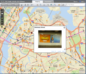
Here’s her map (a work in progress) via ArcGISOnline and ArcGIS Explorer:

Here are some example photos via her Flickr stream. If anyone has suggestions on helping her with the next steps for her map, please get in touch (their Twitter handle is @EMTAA).

Inspiring similar efforts in other cities

Soon after I wrote my blog post with the MTA’s data in GIS format, it had an impact not only here in New York but in at least one other city: Chicago. Blogger and urban planning advocate Steve Vance adapted my methodology to transform the GTFS data from the Chicago Transit Authority into GIS format. Here’s his post: http://www.stevencanplan.com/2010/obtaining-chicago-transit-authority-geodata/ , plus a more in-depth discussion of his technique: http://www.stevencanplan.com/2010/how-to-convert-gtfs-to-shapefiles-and-kml/

Proximity of bus stops to pedestrian accidents

This week the Tri-State Transportation Campaign published an analysis of pedestrian fatalities in Nassau County and several towns in Connecticut, and noted that in Nassau, for example, 83% of the fatalities from 2008-2010 occurred within a quarter-mile of a bus stop. The group used my GIS version of MTA’s bus GTFS data for their analysis.

I haven’t examined TSTC’s report closely, so I’m not sure how strong of a causal relationship exists between bus stops, per se, and the fatalities (an anonymous commenter at TSTC’s blog argues that “Of course the most pedestrian deaths occur near bus stops, they’re located in the only places in the county where anyone actually walks”).

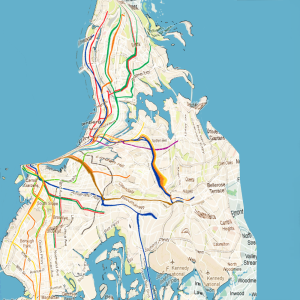
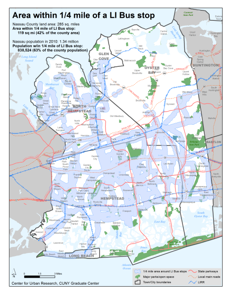
But one observer on Twitter, @capntransit, wondered if buses are so ubiquitous that the relationship would be a non-issue (they wrote “Isn’t 85% of Nassau County within a quarter-mile of a bus stop?”) I thought I’d try to answer, and came up with the following by mapping the bus stops and block-level population data from the 2010 Census:

  • Nassau County’s land area is 285 square miles. The area within 1/4 mile of all LI Bus stops is 119 square miles (42% of the county area); and
  • Nassau’s population in 2010 was 1.34 million people. The population within 1/4 mile of all LI Bus stops in 2010 was 838,524 people (63% of the county population).
  • So on the face of it, the concentration of fatalities near bus stops seems disproportionately higher than the overall nearby population. The map below highlights the bus stop coverage:

I’m glad my data conversion efforts have been helpful. It’s only possible due to the MTA’s ongoing effort to provide easy public access to their data sets. This enables me and many others to help improve life in and around the city by integrating their data into maps, applications, government accountability efforts, and more. Please send more examples of how you’ve been able to use the data; highlighting these projects helps us all.

Follow

Get every new post delivered to your Inbox.