Scouring the internet for the perfect logo inspiration? Stop right there! We’ve rounded up the best real estate logos from around the world so you can skip the search.
PS: We’re adding more logos to the list every week, so check back each week for fresh updates!
1. Best Real Estate Logos from Australia
While searching for the most iconic Australian logos in real estate, I came across a few that really caught my eye.
This is what I noticed with the Australian logos:
✅ Australian real estate logos use bold, vibrant colors that make them stand out and reflect the energy and dynamism of the market.
✅ There’s a strong emphasis on clean, minimalist designs that still manage to convey a lot of personality and professionalism.
✅ Australian logos often incorporate symbols like houses, keys, or abstract shapes that instantly communicate their connection to real estate.
1.1 Ray White
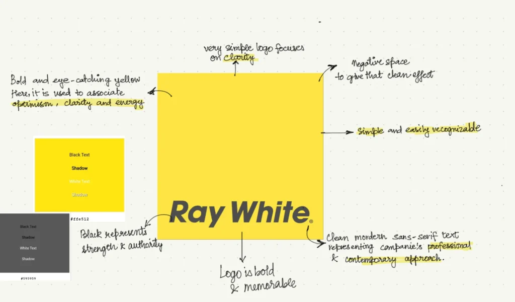
When I first noticed the Ray White logo, it stood out right away. The bright yellow is the first thing that grabs you—it’s bold, vibrant, and full of energy. But then you also notice the not-so-common italic font and a lot of room around to text to give it a clean, minimalist look!
It reminded me a bit of the Savills logo in the UK, with that same standout yellow, but Ray White adds its own unique twist. It’s a logo that’s hard to miss and easy to appreciate.
Why I like the logo:
- There’s no single element that overpowers the others in this logo—the designer has expertly balanced the vibrant color with minimal text and plenty of negative space.
- Spot it on a billboard, and it’s likely to stick in your mind. See it on a flyer, and you’re sure to remember it. That’s the beauty of this brand’s recall power.
- This logo has a personality all its own. It breaks the mold in every way—the color is bright, not neutral; the text is italic, not bold. Who even does that? And that’s exactly why I love it!
More about the brand:
| Aspect | Details |
| Founded | 1902 |
| Headquarters | Brisbane, Australia |
| Logo Evolution | The Ray White logo has remained relatively consistent, featuring a clean, modern sans-serif typeface. The logo is often presented in a simple white font against a bright yellow background, making it highly recognizable and distinctive. The use of yellow symbolizes energy, optimism, and innovation. |
| Notable Changes | Over the years, the logo has seen only minor adjustments, primarily focusing on font refinement and color tone consistency. This consistency has helped maintain strong brand recognition across Australia and internationally. |
| Brand Significance | Ray White is one of the largest and most well-known real estate groups in Australia, and its logo reflects a brand that is both approachable and professional. The bright yellow color has become synonymous with Ray White’s energetic and forward-thinking approach to real estate |
1.2 LJ Hooker
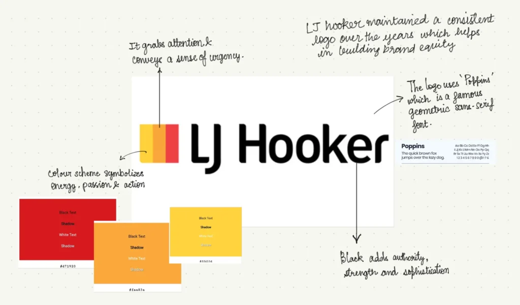
LJ Hooker’s logo reminds me of an autumn evening, with its color scheme evoking the hues of a dusky sky. I know… I know… I might be stretching it a bit, but it really does feel like watching the sun set over the horizon.
The logo definitely commands attention—thanks to those bold, bright colors—yet it still manages to convey a sense of trust. It’s the kind of design that would have made sense back in the 90s and will still make perfect sense in the 2030s.
Why I like the logo:
- The logo marries the power of typography with bright, bold colors—a daring move that really pays off.
- The use of a bold sans-serif font ensures the brand name stands out clearly, while the clean lines and sharp edges of the design reinforce the brand’s modern and reliable image.
- The logo uses combination mark technique and the design choice on it adds depth to the logo, making it more versatile and memorable across various mediums
💡What is Combination Mark Logo?
Combination marks are logos that join two or more different types of logos together. For example, they might have a picture above or below text, or text inside a picture.
These logos are popular because they combine two recognizable parts of your brand into one. However, they can be a bit more complex than simple word marks or brand marks ( we will talk about these later!).
More about the brand:
| Aspect | Details |
| Founded | 1928 |
| Headquarters | Sydney, Australia |
| Logo Evolution | The LJ Hooker logo features a bold, modern design with a distinctive red and black color scheme. The logo typically uses a strong sans-serif typeface that emphasizes clarity and professionalism. Over the years, the logo has undergone minor refinements, but the core elements, such as the color palette and typography, have remained consistent. |
| Notable Changes | While the logo has seen subtle updates to modernize its appearance, the brand has maintained its iconic red and black colors, which are synonymous with trust, authority, and reliability in the Australian real estate market. |
| Brand Significance | LJ Hooker is one of the most recognized names in Australian real estate, and its logo reflects the brand’s long-standing reputation for excellence, innovation, and customer service. The bold design and colors ensure that the logo stands out, making it memorable and easily identifiable. |
2. Best Real Estate Logos from the UK
While digging into 500 or maybe 1000+ logos, what I found was real estate logos in the UK are created in typographic style.
💡What is Typographic Style Logo?
Any logo that is without icons and abstract images. Typographic logos—or text-only logos—get to the bare essentials of who you are as a company. They help you to express your brand’s character through distinct colors, letter style, and clever font tweaks.
The world’s biggest brands, like Facebook and Google, understand the power of typographic logos and how best to use them, and by the end of this post, you will too!
The UK logos are all about simplicity. They mostly stick to sans-serif fonts, which are clean and easy to read. The designs are minimal—usually just the brand name, no frills. But where they do get creative is with color.
Here’s what I learnt:
✅ Brands use straightforward, modern fonts that are easy on the eyes. It’s all about looking professional without being too flashy.
✅ The logos are classic ( you can compare them to the Little Black Dress)—simple but effective. No extra graphics, just the brand name doing all the talking.
✅ Colors are where the magic happens. The color choice says a lot about the brand—whether they’re cool and calm like blue or fresh and eco-friendly like green.
You’ll see what I am talking about as we analyze the best UK logos!
2.1. Savills
“Simple can be harder than complex.”- Steve Job
I feel this quote sit perfectly right for Savills that has a logo that one can not easily forget!
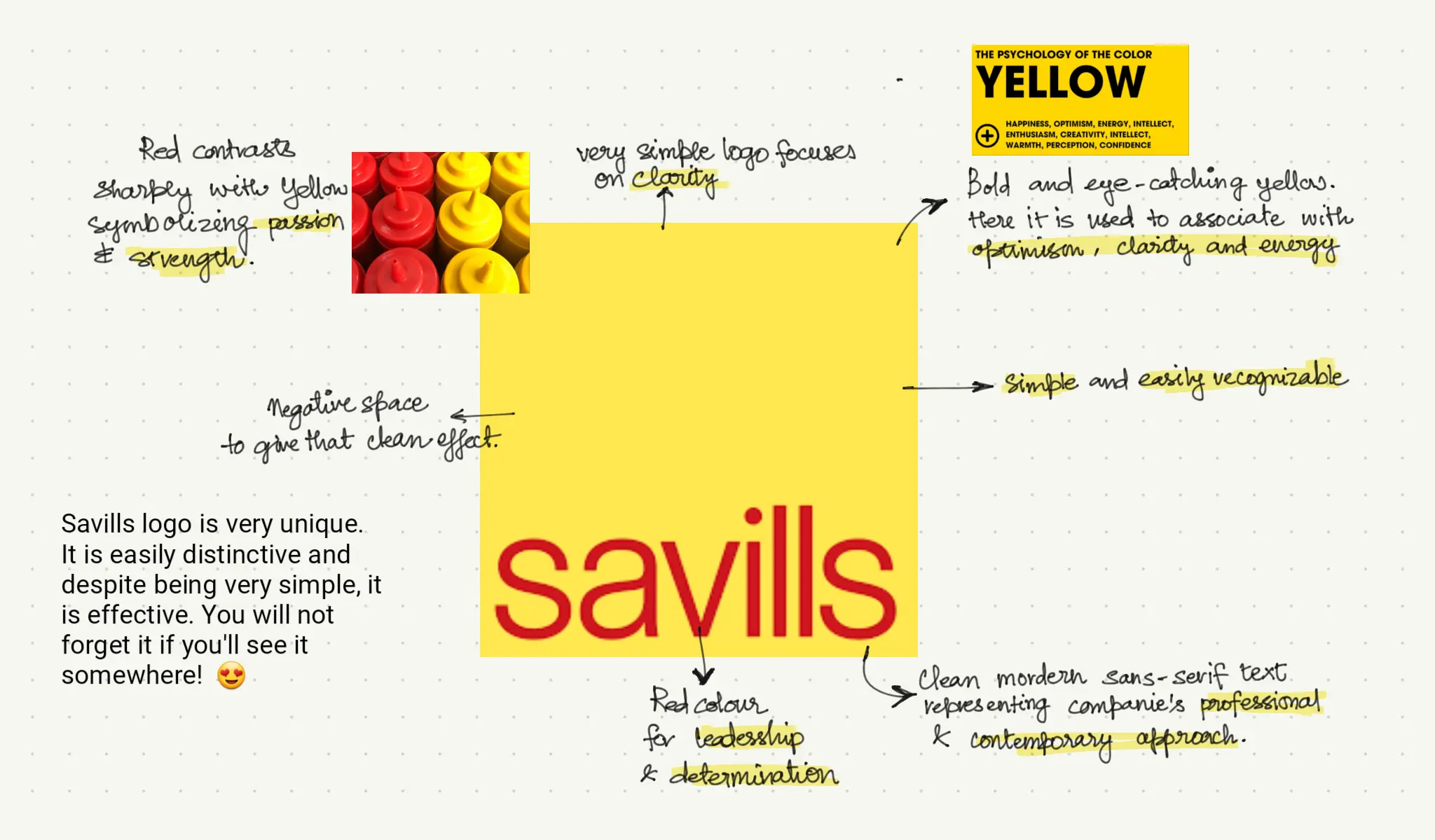
Despite being a 169-year-old brand, the logo’s fresh and modern design is anything but dated. While the logo has evolved in the past so many years, this current yellow and red combination has to be my absolute favourite!
Why I like the logo:
- It is unmissable—period. If I see this on a billboard, there’s a good chance I won’t forget it. One reason is that the logo is reminiscent of McDonald’s, so there’s a lot of nostalgia associated with the colors.
- I love how bold and bright it is. It’s confident and expressive. The design is simple yet elegant, showcasing how modern art can be both minimalist and impactful.
- There is no overpowering element in the logo, the designer has perfectly balance the pop of color with minimal text and a lot of negative space!
Here’s some addition background that you didn’t ask for but that can come in handy
| Aspect | Details |
|---|---|
| Founded | 1855 |
| Headquarters | London, England |
| Logo Evolution | The logo features a bright yellow square with the brand name in a minimalist, lowercase sans-serif font, creating a contemporary yet classic feel. |
| Notable Changes | Savills has maintained a consistent logo design, emphasizing stability and trust in the brand. |
| Brand Significance | As one of the oldest and most prestigious real estate companies in the UK, Savills’ logo reflects their heritage and continued leadership. |
2.2. Knight Frank
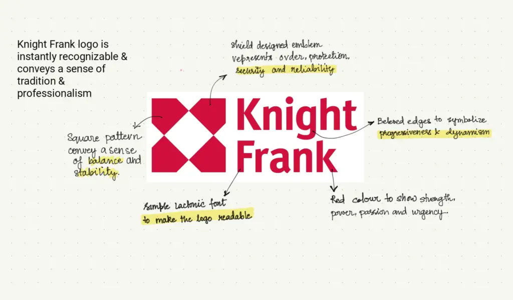
Just like in movies, I love when logos start conversations and can be interpreted in different ways. It might sound a little fancy, but look at the Knight Frank logo above. What do you see? A shield? A random geometric design? Or maybe a bunch of tiny houses?
That’s what I am talking about—we don’t know for sure, but it definitely gives off the vibe that we’ll be taken care of with this brand.
Why I like the logo:
- The emblem is for sure intriguing(for lack of better words). The more you look at it, the more it begins to represent something deeper. It’s almost like a puzzle, which is definitely a plus!.
- The red color is bold, commanding attention and conveying confidence without being overwhelming. Really love how it is balanced with sophisticated typography so that everything seems balanced.
More about the brand:
| Aspect | Details |
|---|---|
| Founded | 1896 |
| Headquarters | London, England |
| Logo Evolution | The logo includes a red emblem with the brand name, representing strength, integrity, and a long-standing tradition of excellence. |
| Notable Changes | The emblem has been slightly modernized, but the classic red color remains central to the brand’s visual identity. |
| Brand Significance | Knight Frank is synonymous with luxury real estate and high-end market expertise in the UK and globally. |
2.3. Foxtons
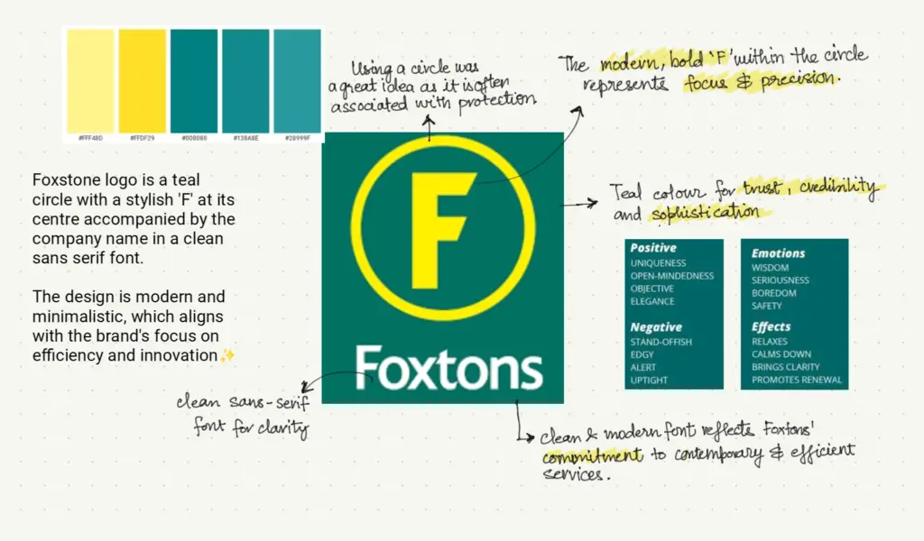
Foxton’s logo is an emerald, quite literally! The rich green color combined with the prominent ‘F’ set within a circle gives it the look of a polished gemstone. It’s like a shiny jewel that says, “Hey, we’re all about growth, prosperity, and making things happen!”
What’s interesting, though, is that this logo, despite resembling a helipad or a target, still works incredibly well. The simplicity of the design somehow aligns perfectly with its intent, making it both memorable and effective.
Why I like the logo:
- Green can be a lucky charm, but it’s a tricky color to use in real estate. The wrong shade can look cheap or even dirty. But Foxtons nailed it! They picked a fancy emerald green that’s like a luxury badge. It says, ‘We’re safe, reliable, and experts in what we do.
- It’s a risky move to focus just on a single letter for your brand. But when done right, it can be a smart one! That ‘F’ is easy to remember, which is huge in a crowded market. It’s like the first step on a new adventure, just like finding a new home.
More about the brand:
| Aspect | Details |
| Founded | 1981 |
| Headquarters | London, England |
| Logo Evolution | The Foxtons logo features a distinct “F” in a circular emblem, often in a bright, vibrant green, symbolizing energy, growth, and modernity. |
| Notable Changes | The logo has remained consistent, with only minor adjustments to color tones and typography over the years, ensuring strong brand recognition. |
| Brand Significance | Foxtons is known for its innovative approach to real estate in the UK, and its logo reflects a forward-thinking, dynamic brand identity. |
2.4 Strutt & Parker
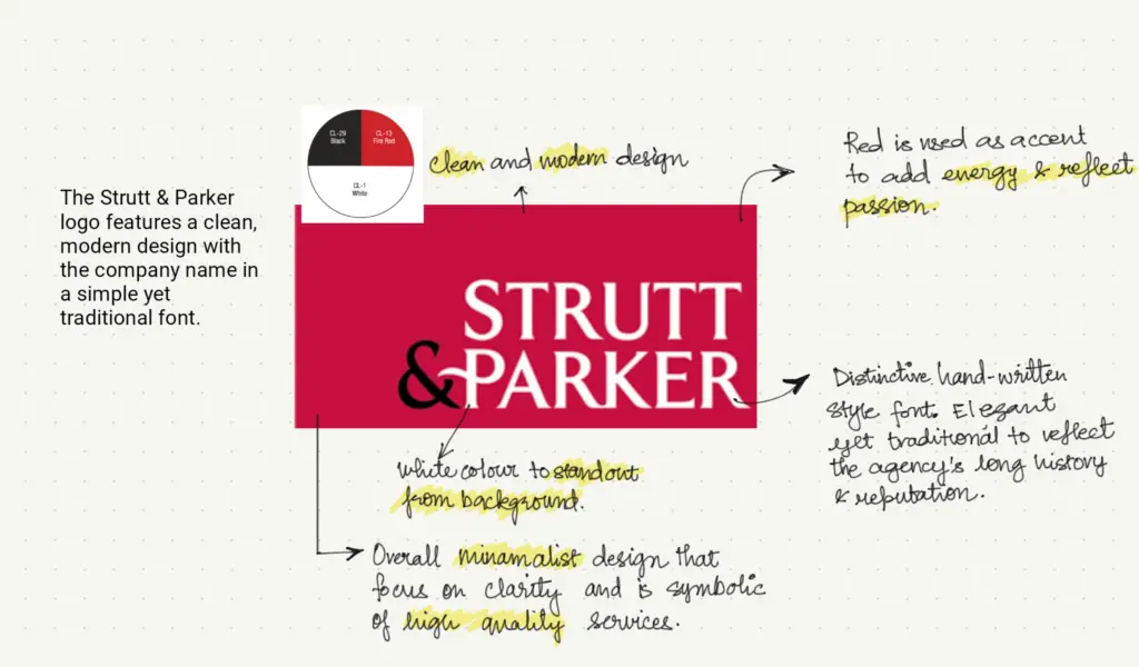
Red and black is a classic combo, but it’s way easier to get it wrong than right. It can come off as too harsh or intense, which might push people away instead of drawing them in. There’s also the risk of it looking too dramatic or even a bit spooky if the balance isn’t spot on. A good example is the 2010 Myspace rebranding, where the red and black color scheme felt too harsh and unapproachable, making the brand seem distant rather than inviting.
But Strutt & Parker’s case is different. The balance between the colors makes their logo look powerful, authoritative, and sophisticated—exactly what a brand should convey in a market as traditional as real estate.
Why I like the logo:
- In Strutt & Parker’s logo, the red and black are like a perfectly mixed cocktail—neither one overpowers the other. This balance creates a smooth, sophisticated vibe that’s just right for their upscale audience.
- The logo’s clean, simple design focuses on the essentials, like typography. It’s elegant without being flashy.
More about the brand:
| Aspect | Details |
| Founded | 1885 |
| Headquarters | London, England |
| Logo Evolution | The Strutt & Parker logo features a traditional serif typeface, reflecting its rich heritage. The logo often uses a deep red color, which exudes sophistication and stability. |
| Notable Changes | While the core elements of the logo have remained consistent, minor modernizations have been made over time, particularly in the refinement of typography. |
| Brand Significance | Strutt & Parker’s logo reflects its longstanding history and reputation in the UK real estate market, conveying trust, heritage, and expertise. |
2.5 Hamptons
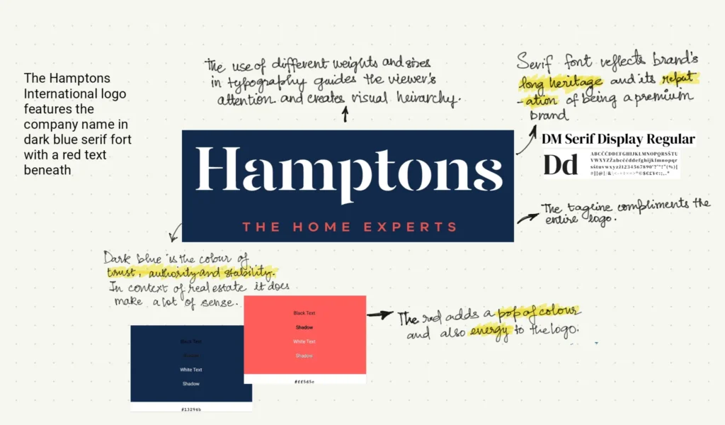
I know what you are thinking—what’s so great about this logo anyway!?
Well, for me, what stands out is how clean it is. Call it a bias, but I’m seeing this from a buyer’s lens. As a buyer, you’re already stressed and overwhelmed by the big financial decision of purchasing a house. The last thing you want is to feel more overwhelmed when it comes time to choose an agent.
Why I like the logo:
- Hampton’s logo is simple and clear. It offer a sense of calm and trust, cutting through the noise and helping you focus on what truly matters.
- The clean lines and professional design embody reliability and transparency—exactly what you need when making such a significant investment.
More on the brand:
| Aspect | Details |
| Founded | 1869 |
| Headquarters | London, England |
| Logo Evolution | The Hamptons logo features a classic serif typeface, often set against a deep blue background, representing tradition, trust, and authority. The logo typically includes gold accents, adding a touch of luxury and elegance. |
| Notable Changes | Over the years, the logo has been subtly refined, with adjustments to the typography and color tones to keep the brand fresh while preserving its heritage. |
| Brand Significance | Hamptons is one of the oldest and most respected names in the UK real estate market, and its logo reflects a commitment to quality and excellence in service. |
3. Best Real Estate Logos from the US
The Real estate US logos are a bit of a mixed bag, but one thing you’ll notice is that most of them feature an emblem or symbol alongside the brand name. They love playing with both imagery and color to make a statement.
Here’s what I’ve picked up:
✅ Logos often include a symbol or emblem, adding an extra layer of identity beyond just the brand name. It’s a definitely more dressed up than the UK typographical style.
✅ Real Estate firm’s in the US are not shy about using imagery, whether it’s a house, a key, or a monogram. These elements give the logos a memorable twist and make them stand out.
✅ The color palette is heavily influenced by red, blue, and white—colors that nod to the American flag.
You’ll see what I mean as we dive into the top real estate logos in the US!
3.1 RE/MAX
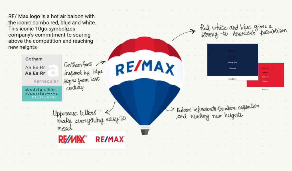
Who doesn’t recognize the iconic RE/MAX hot air balloon! It is over 50 years old and is a huge part of RE/MAX brand’s identity!
The iconic hot air balloon in the RE/MAX logo first took flight in 1978, originally serving as a promotional tool. Its instant popularity made it to become the official emblem of the company.
The balloon perfectly captures the soaring aspirations of homebuyers and sellers alike. It also solidifies RE/MAX’s unwavering commitment to helping clients reach new heights in their real estate journey.
Over the years, RE/MAX’s balloon has evolved into a powerful symbol of the brand, reflecting its core values, vibrant culture, and steadfast commitment to excellence.
Here’s how the changed happened and honestly while the current logo is much clearer and nicer I kind of like the 1978 one!
This particular logo is built in a combination of symbol and emblem style. What that’s you ask?
💡What is Emblem & Symbol Style Logo?
Symbol logos are typically simple and abstract designs that represent a brand’s core values or ideas. They are often single elements that are easily recognizable, such as the Nike swoosh or the Apple bitten apple
Emblem logos, on the other hand, are more detailed and intricate designs that often include a combination of text and imagery. They are typically associated with heritage, authority, and tradition. Examples of emblem logos include the McDonald’s golden arches, Harley-Davidson’s winged eagle, and the United States Army’s seal.
Why I like the logo:
- Honestly, what’s not to love? The hot air balloon is such a fun and uplifting symbol—it feels like it’s saying, “Let’s go on an adventure!” It’s more than just a logo; it’s a little reminder that with RE/MAX, you’re in good hands, ready to soar to new heights in your real estate journey.
- And those colors? The bold red, white, and blue make it pop in a way that’s both eye-catching and comforting. It’s like a friendly wave that you can’t help but notice, no matter where you are. Simple, memorable, and totally uplifting—this logo just makes you feel good!
More about the brand:
| Aspect | Details |
| Founded | 1973 |
| Headquarters | Denver, Colorado, USA |
| Logo Evolution | The RE/MAX logo is iconic for its use of a red, white, and blue hot air balloon, symbolizing freedom, ambition, and limitless possibilities. The bold, uppercase typography of the brand name emphasizes strength and professionalism. |
| Notable Changes | While the logo has been modernized over the years—particularly in terms of font and the balloon’s design—the core elements have remained consistent, ensuring strong brand recognition globally. |
| Brand Significance | RE/MAX is one of the largest real estate networks in the world, and the hot air balloon has become a symbol of its expansive reach, innovation, and leadership in the industry. |
3.2 Keller Williams
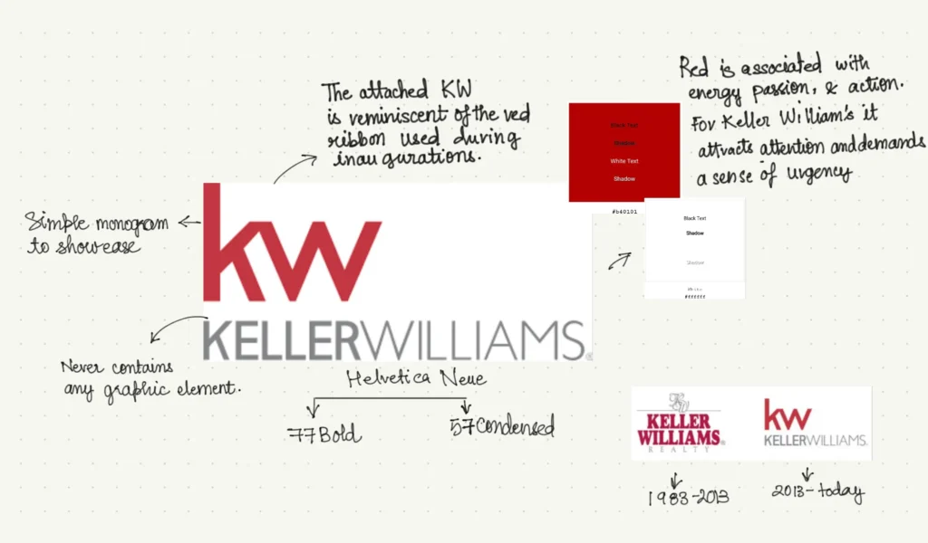
The Keller Williams logo? It’s got that perfect mix of simplicity and some how it give off a very strong vibe. The clean design and bold red lettering make it pop and stick in your mind. It’s the kind of logo that screams, “We mean business,” but in the best way possible.
It’s professional, trustworthy, and totally in line with the no-nonsense, client-first vibe that Keller Williams is all about.
Why I like the logo:
- While the text is the main attraction in a typography logo, what stands out for me is the bold red white color scheme.
- This bold and memorable ‘KW’ symbol is instantly recognizable, representing the brand’s identity and the Keller Williams name.
More on the brand:
| Aspect | Details |
| Founded | 1983 |
| Headquarters | Austin, Texas, USA |
| Logo Evolution | The Keller Williams logo features a clean and modern sans-serif typeface, with the brand name typically presented in a bold red color. The design emphasizes simplicity and professionalism, making it easily recognizable and versatile across various platforms. |
| Notable Changes | The logo has remained relatively consistent, with minor adjustments to typography and spacing to enhance its modern appeal while retaining the core elements that define the brand. |
| Brand Significance | Keller Williams is known for its innovative and agent-centric approach to real estate, and the logo reflects the company’s commitment to modernity, growth, and excellence in service. |
3.3 Coldwell Banker
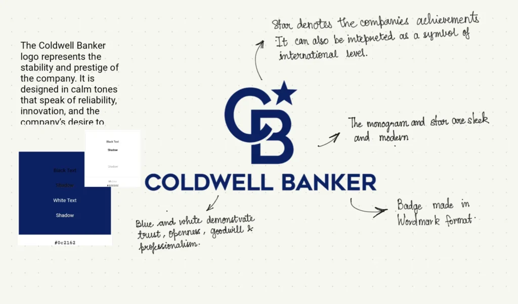
When I was checking out real estate logos, the Coldwell Banker logo totally caught my eye, thanks to its distinctive “CB” monogram. You can’t miss it—it’s often surrounded by a shield or circular frame that really makes it pop. The logo is in the emblem style and is definitely designed to stand out.
Sure, they played it safe with the blue color, which is pretty popular among real estate brands in the US, but they really nailed it with that monogram. It’s classy and gives off a vibe of tradition and trustworthiness, which is exactly what you want in a real estate brand.
Why I like the logo:
- This design usually pops against a blue background.
- It’s memorable, professional, and totally nails the “real estate done right” feel.
- the “CB” monogram just has this way of sticking with you—definitely a smart move on their part!
More on the brand:
| Aspect | Details |
| Founded | 1906 |
| Headquarters | Madison, New Jersey, USA |
| Logo Evolution | The Coldwell Banker logo has evolved from a traditional serif typeface to a more modern, bold sans-serif font. The most recent redesign introduced a new star-shaped emblem representing “excellence, commitment, and success.” The logo typically features a deep blue color, symbolizing trust, stability, and professionalism. |
| Notable Changes | In 2020, Coldwell Banker refreshed its logo with the “CB North Star” mark, adding a modern twist while preserving its legacy and brand recognition. The new design emphasizes innovation and leadership in the real estate industry. |
| Brand Significance | Coldwell Banker is one of the most established and respected real estate brands globally, and its logo reflects a commitment to tradition while embracing modernity and forward-thinking innovation. |
3.4 Century 21
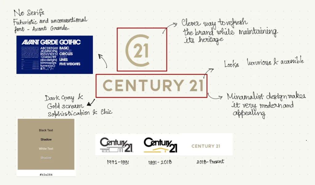
There you go! Another emblem-type logo that I really liked—especially the “C21” monogram.
It’s got this classy vibe that’s hard to miss, and it almost looks like a copyright mark, which gives it a sense of authority and distinction. The font is unique and sleek with clean lines and just the right amount of boldness. It’s not your typical, run-of-the-mill typeface—it feels custom-made, designed to reflect the brand’s forward-thinking and innovative approach.
Why I like the logo:
- The spacing between the letters makes the logo cleaner and the roundness in the font gives out an inviting feeling.
- The font complements the overall emblem perfectly. I actually cannot image this monogram in any other sans-serif font.
- the “CB” mongram just has this way of sticking with you—definitely a smart move on their part!
More on the brand:
| Aspect | Details |
| Founded | 1971 |
| Headquarters | Madison, New Jersey, USA |
| Logo Evolution | The Century 21 logo has undergone significant changes over the years, moving from a more traditional, bold gold-and-black design to a sleek, minimalist logo. The most recent redesign features a simplified, modern sans-serif typeface and a refined gold and black color palette, with a stylized “C21” emblem that represents a new, modern identity. |
| Notable Changes | The 2018 rebranding was a major shift, replacing the iconic “21” and house symbol with a more abstract, clean design that emphasizes modernity, innovation, and a fresh perspective in real estate. The new logo aims to attract a younger, more digitally-savvy audience. |
| Brand Significance | Century 21 is known for its global reach and innovation in real estate, and the recent logo redesign reflects its commitment to staying relevant and ahead of trends in a rapidly evolving industry. |
3.5 Philip Scheinfeld Team
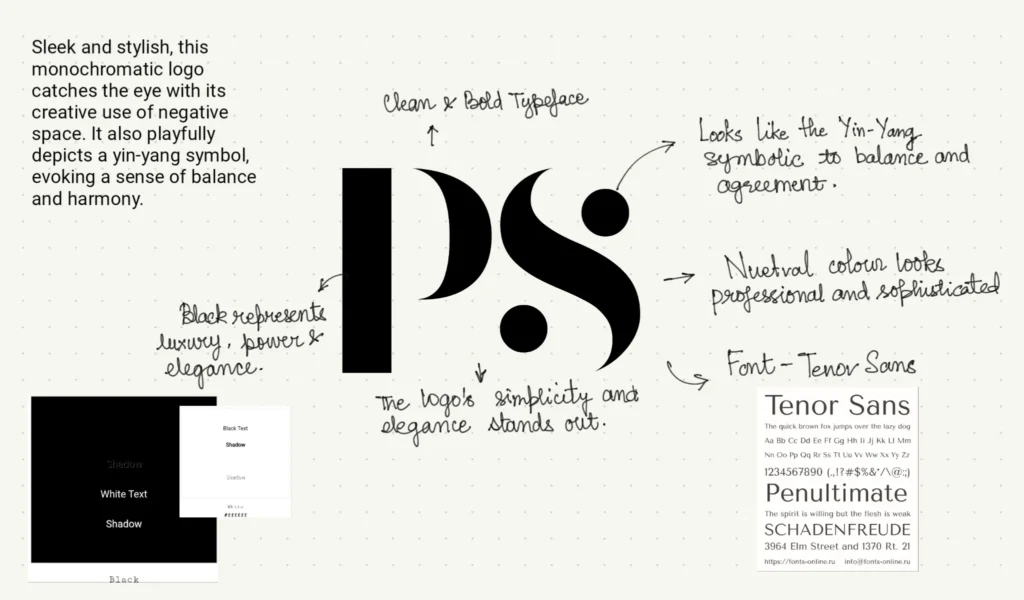
The Philip Scheinfeld Team logo is a standout example of how powerful typography can help build a strong brand identity.
First off, that font? It’s crisp, bold, and just strong. It’s like the logo’s way of saying, “We’re on the cutting edge of what’s cool and effective in real estate.”
What stands out for me is the simplicity yet sophistication of the logo.
Why I like the logo:
- The logo has a Yin and Yang vibe, symbolizing balance, which is a common and positive symbol in real estate—a great sign for any brand in this industry.
- The bold, crisp font grabs your attention without trying too hard.
- It’s the kind of logo that makes you feel like you’re dealing with experts who are also approachable and easy to work with.
More on the brand:
| Aspect | Details |
| Founded | Not widely publicized; active primarily in recent years |
| Headquarters | New York, USA |
| Logo Evolution | The Philip Scheinfeld Team’s logo typically features a clean, modern design, often using a minimalist approach with a monochromatic color scheme. The logo emphasizes simplicity and elegance, reflecting the high-end, luxury real estate market that the team specializes in. |
| Notable Changes | The logo design has remained consistent, focusing on a sophisticated and professional aesthetic that appeals to an upscale clientele. The branding is centered around the personal reputation and recognition of Philip Scheinfeld in the competitive New York real estate market. |
| Brand Significance | The Philip Scheinfeld Team is known for its expertise in luxury real estate in New York City. The logo reflects a brand that values exclusivity, high standards, and personal service. |
3.6 Zillow
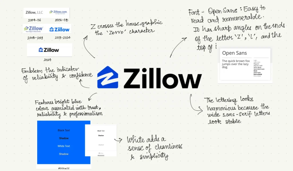
I have kept the best for the last. A logo that is quite famous across the globe.
Let’s be real—Zillow’s logo is recognized all over the world. It’s simple, memorable, and instantly makes you think of real estate. That kind of global recognition isn’t easy to achieve, and it’s a big reason why this logo stands out.
But we cannot deny that the iconic image of a blue house with a ‘Z’ has not been etched into our memories for eternity and that’s only because of the subtle messaging in the l;ogo design.
What I like about this logo:
- The clever “Z” doubles as a house roof, instantly showing Zillow’s real estate focus🤯—simple, smart, and straight to the point.
- The minimalist design feels cozy and welcoming, perfectly capturing that “home sweet home” vibe.
- It’s a globally recognized logo that’s evolved subtly over time, staying fresh and familiar no matter where you see it.
More on the brand:
Aspect | Details |
| Founded | 2006 |
| Headquarters | Seattle, Washington, USA |
| Logo Evolution | The Zillow logo has evolved from a more complex design to a simpler, more modern look. The original logo featured a blue “Z” icon resembling a house with dynamic lines, symbolizing movement and innovation in the real estate market. The current logo maintains the “Z” icon but has refined the lines and typography for a cleaner, more contemporary appearance. |
| Notable Changes | The logo was simplified in recent years to emphasize digital presence and ease of recognition across platforms. The color palette has remained consistently blue, representing trust, stability, and professionalism. |
| Brand Significance | Zillow is a leading online real estate marketplace, and its logo reflects its role as a modern, tech-driven company in the real estate industry, providing innovative tools and resources for both consumers and professionals. |
Over to You People!
That’s it folks! As mentioned we will be populating more of these logos for you to take inspiration from. If you come across any logos that inspire you, don’t forget to drop them in the comment box below.


